10 Canvas HTML Template Sections Every Landing Page Needs
Why Section Order Matters on a Landing Page
A landing page is not a homepage. It has one job: move a specific visitor toward a specific action. That means every canvas html section you include must earn its place, and the sequence must mirror the psychological journey from curiosity to confidence to commitment. The ten sections below represent the minimum viable structure for a landing page that converts in 2025, each mapped to a Canvas component you can drop in and customise.
If you want a broader introduction to what Canvas can do before diving into individual sections, the Complete Guide to Canvas HTML Template is a useful starting point.

1. The Hero Section
The hero is the first thing a visitor sees, and it must communicate your value proposition in under five seconds. In Canvas, the hero is typically built inside a section element with a full-height or large-padding container, a headline, a subheadline, and a primary call-to-action button. Canvas uses Bootstrap 5’s grid, so a two-column hero — text left, image right — is straightforward.
<section id="hero" class="py-6">
  <div class="container">
    <div class="row align-items-center">
      <div class="col-lg-6">
        <h2 class="display-4 fw-bold">Launch Faster with Structured Layouts</h2>
        <p class="lead mt-3">Everything you need to build a high-converting landing page — already inside Canvas.</p>
        <a href="#pricing" class="button button-large button-rounded mt-4" style="background-color: var(--cnvs-themecolor); color: #fff;">Get Started Free</a>
      </div>
      <div class="col-lg-6">
        <img src="images/hero-illustration.svg" alt="Product illustration" class="img-fluid">
      </div>
    </div>
  </div>
</section>
Note the use of var(--cnvs-themecolor) for the button background — this keeps your brand colour consistent across every section without hardcoding hex values.
2. Social Proof and Trust Bar
Immediately below the hero, a trust bar neutralises scepticism before it forms. This is a strip of recognisable logos, a star rating, or a simple stat row (“Trusted by 12,000+ teams”). In Canvas, this is a section with a light background using Bootstrap’s bg-light utility and a flex row of logo images.
<section id="trust-bar" class="py-4 bg-light">
  <div class="container text-center">
    <p class="text-muted mb-3">Trusted by teams at</p>
    <div class="d-flex flex-wrap justify-content-center align-items-center gap-4">
      <img src="images/logo-acme.svg" alt="Acme" height="28">
      <img src="images/logo-verve.svg" alt="Verve" height="28">
      <img src="images/logo-stackio.svg" alt="Stackio" height="28">
    </div>
  </div>
</section>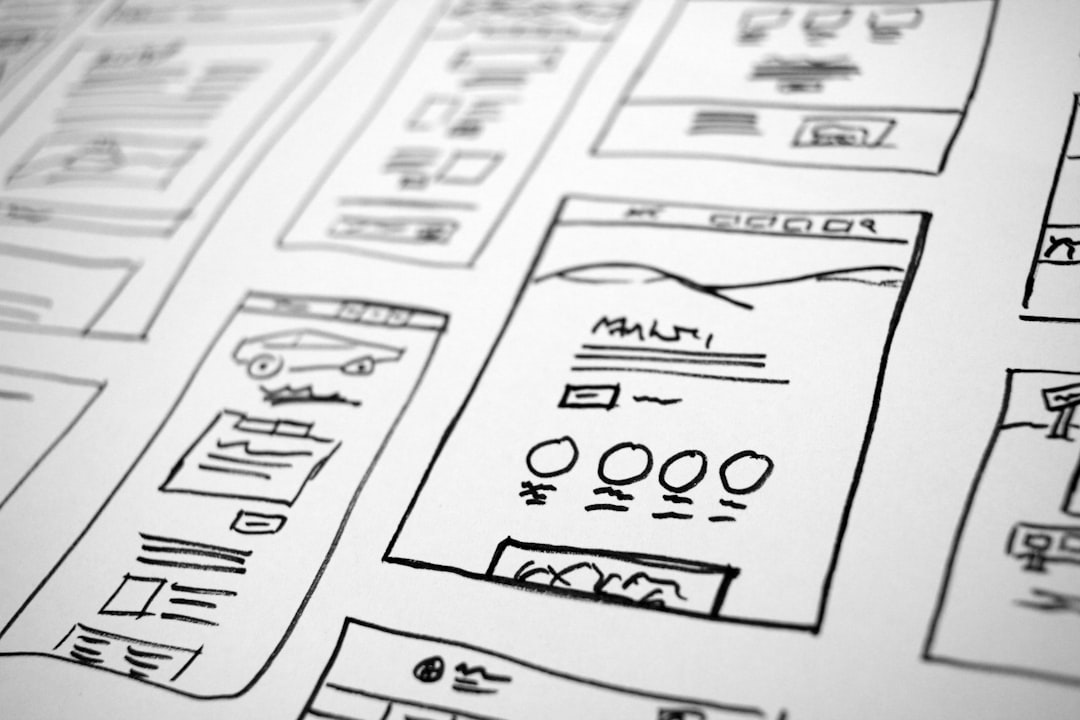
3. Features and Benefits Section
Visitors need to understand what your product does and why it matters to them. This section uses a three or four-column grid of icon cards. Canvas ships with the font-icons.css file, giving you access to a large icon set without additional imports. Keep each card to one sentence of benefit copy — features tell, benefits sell.
<section id="features" class="py-6">
  <div class="container">
    <div class="row g-4">
      <div class="col-md-4 text-center">
        <i class="icon-line-speedometer fs-2 mb-3" style="color: var(--cnvs-themecolor);"></i>
        <h3 class="h5 fw-semibold">Faster Builds</h3>
        <p class="text-muted">Go from blank file to live layout in a fraction of the usual time.</p>
      </div>
      <div class="col-md-4 text-center">
        <i class="icon-line-layers fs-2 mb-3" style="color: var(--cnvs-themecolor);"></i>
        <h3 class="h5 fw-semibold">Reusable Sections</h3>
        <p class="text-muted">Every block section is self-contained and portable across projects.</p>
      </div>
      <div class="col-md-4 text-center">
        <i class="icon-line-genius fs-2 mb-3" style="color: var(--cnvs-themecolor);"></i>
        <h3 class="h5 fw-semibold">Clean Code Output</h3>
        <p class="text-muted">Production-ready HTML that follows Canvas conventions throughout.</p>
      </div>
    </div>
  </div>
</section>
4. How It Works
A numbered process strip removes friction by answering the implicit question: “What do I actually have to do?” Three or four steps, each with a number, a short title, and one sentence of explanation. Keep this section visually minimal — it should feel effortless to read. Canvas’s process component or a simple numbered flex row both work well here.
5. Testimonials, Pricing, and Primary CTA
These three html landing page components are grouped here because together they form the conversion engine of your page. Position them in this order for maximum effect.
testimonials should appear before pricing. A quote from a recognisable customer or a specific result (“Reduced our build time by 60%”) is worth more than any copy you write yourself. In Canvas, a card-based testimonial grid or a full-width quote block with a dark background both perform well.
Pricing needs to be transparent. Visitors who have to hunt for a price leave. Use Canvas’s pricing table component with clearly differentiated tiers, highlight the recommended plan with var(--cnvs-themecolor) as the border or badge colour, and include a per-tier feature list. If you are building a SaaS landing page, a three-tier model with a monthly/annual toggle is the standard that visitors expect.
The primary CTA section is a full-width band — often with a contrasting background — that repeats your main action. Place it after pricing so visitors who are ready can act immediately without scrolling back up. One button, one line of supporting copy, no distractions.
<section id="cta-band" class="py-6 text-center text-white" style="background-color: var(--cnvs-themecolor);">
  <div class="container">
    <h2 class="fw-bold mb-3">Ready to build your landing page?</h2>
    <p class="mb-4 opacity-75">Join thousands of developers already using Canvas Builder.</p>
    <a href="/signup" class="button button-large button-rounded button-light">Start for Free</a>
  </div>
</section>
6. FAQ and Footer
A well-written FAQ section handles objections that would otherwise kill conversions silently. Five to eight questions drawn from real sales conversations are more valuable than a generic list. In Canvas, an Bootstrap accordion component keeps the section compact without hiding important information. The footer itself should be minimal on a dedicated landing page — a logo, a copyright line, and links to Privacy Policy and Terms are sufficient. Avoid a full multi-column footer that encourages visitors to wander away from your conversion goal.
For agencies building multiple client landing pages, the workflows described in Canvas HTML Template for Agencies show how to systematise section reuse across projects so you are not rebuilding these components from scratch every time.
If you are deciding whether a landing page should be a single-page layout or part of a larger multi-page site, the comparison in One-Page vs Multi-Page Websites lays out the decision criteria clearly.
Frequently Asked Questions
What is the difference between a Canvas blocksection and a fullpagelayout?
A blocksection is a single, self-contained component — a hero, a pricing table, a testimonial strip — that can be embedded into any page. A fullpagelayout is a complete multi-page niche demo with its own header, navigation, and footer structure. For a landing page, you will typically assemble individual block sections inside a single_page layout type.
Do I need to load Bootstrap 5 separately when building with Canvas?
No. Canvas bundles Bootstrap 5 internally. Loading Bootstrap from a CDN alongside Canvas will cause conflicts. All Bootstrap 5 utilities, grid classes, and components are available as soon as you include Canvas’s style.css and the two JS files: js/plugins.min.js and js/functions.bundle.js.
How do I change the accent colour across all landing page sections at once?
Set --cnvs-themecolor in your root CSS. Every Canvas component that references this variable — buttons, icon colours, borders, badges — will update automatically. You do not need to hunt through individual section stylesheets.
Which section should contain the primary call-to-action button?
Your primary CTA button belongs in the hero section so it is visible without scrolling, and it should be repeated in a dedicated CTA band after your pricing section. Visitors who are convinced early can convert immediately; visitors who need more persuasion will reach the second CTA after testimonials and pricing have done their work.
How many sections is too many for a landing page?
There is no hard maximum, but every section must serve the conversion goal. The ten sections in this post represent a complete, proven structure. Adding sections beyond this — a blog preview, a news strip, a secondary navigation — dilutes focus. If you find yourself adding sections to fill space rather than to answer a visitor objection, cut them.
If you’re working with the Canvas HTML Template and want to generate production-ready layouts faster, try Canvas Builder free and see how much time you save on every project.