
The pet industry crossed $150 billion globally in 2023 — and it’s still
climbing. Owners don’t just buy food and toys; they buy into a brand that
feels worthy of their companion. That means your pet brand website
design has to do more than list products. It has to communicate
quality, warmth, and trust within the first five seconds.
Whether you’re building from scratch or refreshing an existingpet product website, this guide walks you through every
layer — visual identity, layout, copy, code — so your site sits comfortably
in the premium tier alongside the brands your customers already love.
🐾 Key Takeaways
- Premium pet websites lead with emotion, not spec sheets.
- A tight colour palette (2–3 tones) and one strong typeface pair signal confidence.
- Full-width hero sections, generous white space, and large product imagery drive perceived value.
- Interactive UI — tabbed ingredient panels, accordions for FAQs — reduces bounce without page bloat.
- Mobile-first layout with Bootstrap 5 breakpoints is non-negotiable; the majority of pet-purchase traffic is mobile.
- A clear conversion path (Shop → Learn → Trust → Buy) needs to be visible on every scroll depth.
Start With Brand Identity, Not Templates
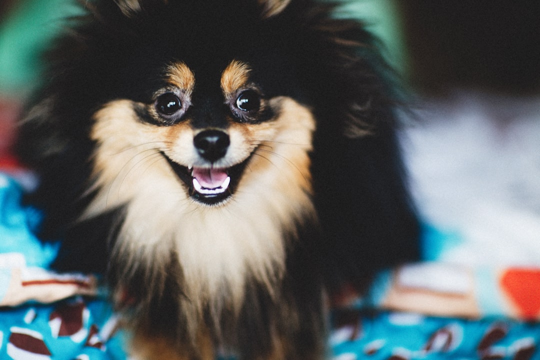
Before you touch a single line of HTML, lock down three brand fundamentals: your colour palette (pick two or three tones maximum — anything more signals indecision, not richness), your typographic pairing (one display weight for headlines, one readable text face for body copy), and your photography direction (lifestyle shots of pets in natural settings, not sterile studio white-background product images). These three decisions are the DNA of every subsequent layout, spacing, and component choice on the site.
Pet brands that skip this step end up with generic sites that could belong to any e-commerce store. A tight palette of oat, charcoal, and warm amber — for example — immediately signals “premium and natural” before the visitor reads a single word of copy. By contrast, a rainbow of accent colours and three competing typefaces reads as amateur, regardless of how polished the code is behind the scenes.
Once those three are fixed, template selection becomes easy. A Canvas HTML
template, for instance, ships with enough pre-built section patterns that you
can map your palette and fonts in minutes — seeCanvas Template Section Patterns: Building Pages Like a Pro
for how to think about that mapping process.
Craft a Hero Section That Converts Emotion Into Clicks
The hero on a pet product website is prime real estate. Owners need to feel
something — affection, reassurance, aspiration — before they read a single word.
That means a full-bleed lifestyle photograph (not a white-background product
shot) and a headline that speaks to the pet, not the SKU.
Structure-wise, keep it simple: one headline, one sub-line, one CTA button. Here
is a Bootstrap 5 snippet you can drop straight into your template:
<!-- Premium Pet Hero Section -->
<section
class="min-vh-100 d-flex align-items-center text-white"
style="
background: url('assets/img/hero-dog.jpg') center/cover no-repeat;
"
>
<div class="container">
<div class="row">
<div class="col-lg-6">
<span class="badge bg-warning text-dark mb-3 px-3 py-2 rounded-pill">
New — Grain-Free Range
</span>
<h1 class="display-4 fw-bold lh-sm mb-4">
Food as good as the love you give.
</h1>
<p class="lead mb-4 opacity-75">
Vet-formulated, cold-pressed nutrition for dogs who deserve better.
</p>
<a href="/shop" class="btn btn-light btn-lg rounded-pill px-5">
Shop the Range
</a>
</div>
</div>
</div>
</section>
Note the min-vh-100 utility — it ensures the hero fills the
viewport on every device without a fixed pixel height that breaks on mobile.
For a deeper dive on responsive sizing,Bootstrap 5 Breakpoints: How to Build Truly Responsive Layouts
covers the logic in full.
Design Product Cards That Feel Luxurious, Not Cluttered
On a premium pet brand website, product cards carry the same
weight as editorial photography. A cluttered card destroys the illusion of
quality. The rule: one image, one name, one price, one action — nothing else
above the fold of the card.
<!-- Premium Pet Product Card -->
<div class="col-md-4 mb-4">
<div class="card border-0 shadow-sm rounded-4 overflow-hidden h-100">
<!-- Product image with hover zoom -->
<div class="overflow-hidden" style="height: 280px;">
<img
src="assets/img/product-kibble.jpg"
alt="Grain-Free Adult Kibble"
class="w-100 h-100 object-fit-cover"
style="transition: transform .4s ease;"
/>
</div>
<div class="card-body p-4">
<span class="text-muted small text-uppercase ls-2">Adult Dog</span>
<h3 class="h5 fw-semibold mt-1 mb-2">Grain-Free Duck & Sweet Potato</h3>
<p class="text-muted small mb-3">Cold-pressed. No fillers. 28% protein.</p>
<div class="d-flex align-items-center justify-content-between">
<span class="fw-bold fs-5">£34.99 <small class="text-muted fw-normal fs-6">/ 5kg</small></span>
<a href="/product/grain-free-duck" class="btn btn-dark rounded-pill px-4">
Add to Bag
</a>
</div>
</div>
</div>
</div>
The object-fit-cover utility keeps imagery proportional regardless
of upload dimensions — a practical necessity when clients upload their own
product photos. If you need more card patterns for your pet product website,8 Bootstrap 5 Card Components You Should Be Using Right Now
is worth bookmarking.
Build Credibility With Smart Trust Signals
Premium pet brands compete on trust as much as taste. Your website needs to
surface proof points without screaming “look how legit we are.” Three areas
that reliably move conversion rates:
-
Vet endorsements: A short quote with a headshot and credentials
(“Dr. Sarah Kim, BVetMed, MRCVS”) outperforms five-star review counts. -
Ingredient transparency: Use a tabbed panel to show
ingredients, nutritional analysis, and sourcing stories side by side. Bootstrap
5 tabs handle this natively with zero JavaScript — see the implementation guide
at Bootstrap 5 Accordion and Tabs: Interactive Content Without JavaScript. -
Certifications row: FEDIAF compliance, organic certification
logos, and manufacturing country flags displayed in a clean icon row beneath
the hero.
Here’s a minimal certification strip you can adapt:
<!-- Trust / Certification Strip -->
<section class="py-4 border-top border-bottom bg-light">
  <div class="container">
    <div class="row align-items-center justify-content-center g-4 text-center">

      <div class="col-6 col-md-2">
        <img src="assets/img/cert-organic.svg" alt="Certified Organic" height="48">
        <p class="small text-muted mt-2 mb-0">Certified Organic</p>
      </div>

      <div class="col-6 col-md-2">
        <img src="assets/img/cert-vet.svg" alt="Vet Approved" height="48">
        <p class="small text-muted mt-2 mb-0">Vet Approved</p>
      </div>

      <div class="col-6 col-md-2">
        <img src="assets/img/cert-fediaf.svg" alt="FEDIAF Compliant" height="48">
        <p class="small text-muted mt-2 mb-0">FEDIAF Compliant</p>
      </div>

      <div class="col-6 col-md-2">
        <img src="assets/img/cert-uk.svg" alt="Made in the UK" height="48">
        <p class="small text-muted mt-2 mb-0">Made in the UK</p>
      </div>

    </div>
  </div>
</section>
Optimise for Mobile-First Performance
More than 65% of pet-related purchases start on mobile. A premium pet website
that stutters on a phone loses customers to a cheaper brand that loads in two
seconds. The baseline checklist:
- Images: Serve WebP with
<picture>fallbacks. Lazy-load anything below the fold. - Fonts: Self-host your chosen pair with
font-display: swap— Google Fonts adds a round-trip latency hit. - Hero video: If you use a background video, provide a poster image and pause on mobile via a
matchMediacheck. - Touch targets: Buttons should be at least 44 × 44 px. The Bootstrap
btn-lgclass hits this by default.
<!-- Responsive lazy-loaded product image -->
<picture>
  <source
    srcset="assets/img/product-kibble.webp"
    type="image/webp"
  />
  <img
    src="assets/img/product-kibble.jpg"
    alt="Grain-Free Duck & Sweet Potato kibble bag"
    class="img-fluid rounded-4"
    loading="lazy"
    width="600"
    height="600"
  />
</picture>
Write Copy That Speaks to the Owner — and the Pet
Pet owners anthropomorphise. They don’t buy food; they cook for their dog. Your
copy has to honour that emotional reality. A few principles that consistently
outperform generic e-commerce copy on premium pet product websites:
-
Lead with outcome, not ingredient: “Shinier coat in 30 days”
beats “Contains omega-3 fatty acids.” -
Use the pet’s name slot: “Made for dogs like [NAME]” in a
personalisation field is a lightweight engagement driver with outsized results. -
Avoid clinical detachment: “Scientifically formulated” reads
cold. “Developed with vets who own dogs” reads warm and credible. -
CTA language: “Add to Bag” outperforms “Buy Now” in premium
segments because it implies leisure, not urgency.
The same principle applies to your subscription or free-trial offers.
If your pet brand runs a starter box or trial programme, reducing friction in the
sign-up flow is critical — the guidance atFree Trial Landing Page: Copy and Design That Reduce Friction
translates cleanly to the pet subscription model.
Design a Subscription Experience That Drives Repeat Purchases
Premium pet brands increasingly rely on subscription revenue — auto-ship kibble, monthly treat boxes, seasonal grooming kits. The subscription sign-up flow is where most pet websites lose the most qualified traffic. A visitor who has already decided they like your product should not face a five-step checkout to start a recurring order.
The design principles that work here mirror the broader premium positioning: simplicity, transparency, and perceived effort. Present three plan tiers (not seven — analysis paralysis kills conversion on mobile). Show the per-day or per-meal cost next to the monthly total (“£1.16/day” beside “£34.99/month”) to reframe the price as trivial rather than significant. Include a one-line cancellation promise (“Cancel or pause anytime — no phone call required”) directly under the CTA button, not buried in a footnote.
On the technical side, use a Bootstrap 5 stepper component inside a card to walk the user through plan → dog profile → delivery schedule → payment. Each step should feel like a continuation, not a new page load — this is where single-page interactivity (tab or accordion navigation) dramatically reduces drop-off compared to multi-page funnels. The Canvas template includes stepper patterns that handle this cleanly, or you can use a simple card-with-tabs approach as shown in the Bootstrap 5 Card Components guide.
Post-purchase, surface the subscription management panel prominently in the customer dashboard. Let owners swap recipes, adjust delivery frequency, or skip a month with a single click. The easier it is to modify, the less likely they are to cancel outright — and that reduction in churn is worth more than any amount of new-customer acquisition spend.
Frequently Asked Questions
tight palette, one hero typeface), emotional photography that centres
the pet, and copy that respects the owner’s intelligence. Anything that
feels rushed — inconsistent spacing, mixed fonts, stock photography —
signals mass-market.
outperform bright primaries in user testing for premium pet brands.
They read as natural, artisan, and trustworthy. Reserve one accent
colour (warm amber or deep teal) for CTAs only.
with limited range; more than six starts to resemble a supermarket aisle.
Curate ruthlessly — show your hero products, then link to the full
catalogue. Scarcity of choice signals confidence.
practically mandatory at the premium tier — stock pet images are
immediately recognisable and undermine brand authenticity. Stock is
acceptable for supporting editorial sections or blog imagery, but
invest in a one-day shoot for your core assets.
production-ready component library — carousels, product cards,
testimonial sections, and more — that you customise with your brand
palette and typography. The key is discipline: strip out any
components that don’t serve your brand story, and the result is
indistinguishable from a fully bespoke build at a fraction of the cost.
If you’re working with the Canvas HTML Template and want to generate production-ready layouts faster, try Canvas Builder free and see how much time you save on every project.