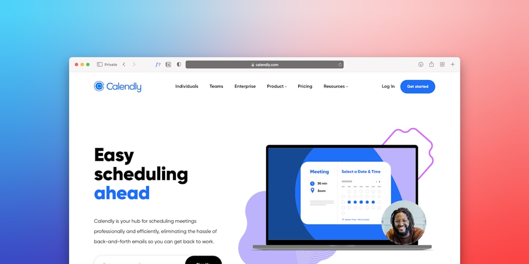
Most AI SaaS homepages look impressive and convert poorly — a stunning hero, a vague value proposition, and a free trial button that nobody clicks. The difference between AI SaaS websites that generate pipeline and those that simply generate compliments comes down to a small set of structural and copy decisions that are entirely replicable.
- The highest-converting AI SaaS landing pages lead with a specific, measurable outcome — not a feature list or a technology pitch.
- Social proof placement, hero copy specificity, and CTA friction are the three variables with the biggest measurable impact on AI website conversion rates.
- Bootstrap 5 layouts built on the Canvas HTML Template can replicate the structural patterns used by top-performing AI SaaS sites without custom development overhead.
- Conversion lifts on AI landing pages rarely come from visual redesigns — they come from removing ambiguity about who the product is for and what happens next.
What Actually Drives Conversion on AI SaaS Websites
The most instructive thing you can do before designing an AI SaaS landing page is study pages that are measurably converting, not just ones that win design awards. Sites like Jasper, Otter.ai, Copy.ai, and Notion AI share a pattern that is easy to miss because it looks simple: the hero section answers three questions in under five seconds. What does this do? Who is it for? What do I do right now?
Generic AI positioning (“the future of work, powered by AI”) fails because it answers none of these. Specific positioning (“write first drafts 3x faster, built for content teams”) answers all three. This is not a copywriting tip — it is a structural constraint. Every section of the page either reinforces or undermines the answer to those three questions.
For teams building with Bootstrap 5, that constraint translates directly into layout decisions: the hero row must not compete with navigation for visual attention, the primary CTA must be visible without scrolling on all viewport sizes, and supporting copy must follow the headline, never precede it.

Hero Section Anatomy That AI SaaS Sites Get Right
The highest-performing AI SaaS heroes in 2025 consistently follow a column structure: outcome-led headline on the left or centre, a supporting subheadline that names the user and the mechanism, a CTA button with zero ambiguity about what happens on click, and a trust signal (logo bar or testimonial snippet) immediately below the fold.
Here is a production-ready Bootstrap 5 hero structure you can drop into a Canvas single_page layout:
<section id="hero" class="py-6 bg-light">
  <div class="container">
    <div class="row align-items-center justify-content-center text-center">
      <div class="col-lg-8">
        <p class="text-uppercase fw-semibold ls-2 mb-3" style="color: var(--cnvs-themecolor);">AI Writing Assistant</p>
        <h1 class="display-4 fw-bold mb-4">Write Better Content in Half the Time</h1>
        <p class="lead text-muted mb-5">Built for marketing teams who need first drafts, not more meetings. Connect your brand voice and go live in minutes.</p>
        <div class="d-flex flex-wrap justify-content-center gap-3">
          <a href="/signup" class="btn btn-lg px-5 py-3 fw-semibold" style="background-color: var(--cnvs-themecolor); color: #fff;">Start Free — No Credit Card</a>
          <a href="#demo" class="btn btn-outline-secondary btn-lg px-5 py-3">Watch 2-min Demo</a>
        </div>
        <p class="small text-muted mt-3">Trusted by 4,200+ content teams at Shopify, HubSpot, and Canva</p>
      </div>
    </div>
  </div>
</section>
Notice that var(–cnvs-themecolor) is used for brand colour, not --bs-primary. Canvas overrides Bootstrap’s colour system with its own variable layer — mixing the two creates inconsistencies that are difficult to debug. The CTA label “Start Free — No Credit Card” removes the two most common objections in a single phrase, which is standard practice on pages like Loom and Otter.ai.
For more detail on structuring CTAs that reduce friction, the post on call-to-action button design covers the science behind button copy, colour contrast, and placement.
Social Proof Placement and the Trust Sequence
AI SaaS sites face a specific credibility problem that e-commerce and professional services sites do not: visitors are being asked to trust an automated system with business-critical output. The trust sequence matters more than on almost any other product category.
The pattern used by the best-converting AI SaaS pages is: logo bar immediately after the hero, case study metric mid-page, and a testimonial carousel anchored above the final CTA. This is not arbitrary — it mirrors the psychological sequence of awareness, interest, and decision that a real sales conversation follows.
A simple, scannable metric row built with Bootstrap 5 grid:
<section class="py-5 border-top border-bottom">
  <div class="container">
    <div class="row text-center gy-4">
      <div class="col-6 col-md-3">
        <h3 class="display-5 fw-bold" style="color: var(--cnvs-themecolor);">3x</h3>
        <p class="small text-muted mb-0">Faster first drafts</p>
      </div>
      <div class="col-6 col-md-3">
        <h3 class="display-5 fw-bold" style="color: var(--cnvs-themecolor);">4,200+</h3>
        <p class="small text-muted mb-0">Active teams</p>
      </div>
      <div class="col-6 col-md-3">
        <h3 class="display-5 fw-bold" style="color: var(--cnvs-themecolor);">98%</h3>
        <p class="small text-muted mb-0">Customer satisfaction</p>
      </div>
      <div class="col-6 col-md-3">
        <h3 class="display-5 fw-bold" style="color: var(--cnvs-themecolor);">14 min</h3>
        <p class="small text-muted mb-0">Average setup time</p>
      </div>
    </div>
  </div>
</section>
Specificity converts. “14 min average setup time” is more credible than “get started in minutes” because it is falsifiable — it implies someone measured it.

Pricing Section Patterns That Reduce Drop-Off
AI SaaS pricing pages have a unique challenge: usage-based pricing models are hard to communicate without triggering anxiety. The sites that handle this best anchor one plan visually, call out the most popular tier explicitly, and reduce the number of feature comparison rows to seven or fewer.
If you are building a comparison table, keep it scannable. Resist the temptation to list every feature — visitors read the first three rows and then scan for price. Use a highlighted column with a Canvas theme-colour border to direct attention to the recommended plan:
.pricing-featured {
  border: 2px solid var(--cnvs-themecolor);
  border-radius: 0.75rem;
  position: relative;
}

.pricing-badge {
  position: absolute;
  top: -14px;
  left: 50%;
  transform: translateX(-50%);
  background-color: var(--cnvs-themecolor);
  color: #fff;
  font-size: 0.75rem;
  font-weight: 600;
  padding: 4px 14px;
  border-radius: 100px;
  white-space: nowrap;
}
This approach is equally applicable when building custom HTML landing pages versus using a drag-and-drop builder — the structural logic stays the same, only the implementation differs.
Whitespace, Hierarchy, and Why Busy AI Pages Lose
A common failure mode on AI SaaS sites is information density. Founders want to explain how the model works, list every integration, and show the product UI all within the first viewport. This competes with the conversion goal instead of supporting it.
The pages that convert use whitespace as a layout tool, not a gap to fill. Each section has one job: the hero converts attention into interest, the social proof section converts interest into credibility, the features section converts credibility into desire, and the CTA section converts desire into action. When a section tries to do two jobs, it usually does neither well.
This is not abstract design theory. For a practical framework on applying whitespace in ways that measurably reduce bounce, see the post on whitespace in web design. The principles map directly to AI SaaS layouts.
In Canvas, controlling section spacing consistently uses the built-in padding utility classes (py-5, py-6) rather than inline margins. This keeps the layout responsive without per-breakpoint overrides.
Building AI SaaS Layouts Faster with Canvas Builder
The structural patterns described above are well-understood by 2025 standards. The bottleneck is execution speed. A typical AI SaaS landing page requires a hero, a logo bar, a metrics row, a features section, a pricing table, a testimonial section, and a footer — at minimum seven distinct layout components, each with mobile-responsive variants.
Building these from scratch on the Canvas HTML Template is achievable, but it requires assembling the right component combinations from Canvas’s extensive library, setting the correct CSS variable values for brand colours and typography, and validating responsiveness across breakpoints.
Canvas Builder generates these section combinations from a prompt, pre-wired with the correct Canvas variable names (including –cnvs-themecolor, –cnvs-primary-font, and –cnvs-header-bg), so the output drops directly into a Canvas project without variable mismatches or JS path errors. If you want to experiment with prompt structures that produce tighter layout briefs, the guide on writing AI prompts for web design is worth reading before you start.
For an AI SaaS page specifically, a prompt that specifies the target persona, the primary conversion action, and the number of pricing tiers produces a layout that requires far less manual restructuring than a generic “SaaS landing page” prompt.
Frequently Asked Questions
What is the most important element on an AI SaaS landing page?
The hero headline is the single highest-leverage element. It determines whether a visitor reads further or bounces. The headline needs to state a specific, measurable outcome for a named type of user — not a category description of the product. Everything else on the page either supports or undermines the promise made in the first five words.
How many CTAs should an AI SaaS landing page have?
One primary CTA repeated at logical decision points — typically after the hero, after the features section, and again above the footer. A secondary CTA (such as “Watch Demo”) is acceptable in the hero alongside the primary, but it should be visually subordinate. Adding more than two CTA types causes decision paralysis and measurably reduces click-through on the primary action.
Should AI SaaS sites show pricing on the landing page?
Generally yes, for self-serve products targeting SMBs and individual users. Hiding pricing increases bounce rates among high-intent visitors who want to self-qualify before booking a call. For enterprise-focused products with deal sizes above four figures, a “Contact Sales” path alongside a starting price or “from $X/month” anchor is the standard pattern used by Salesforce, Gong, and similar enterprise SaaS sites.
How does the Canvas HTML Template handle AI SaaS page layouts?
Canvas is built on Bootstrap 5 and ships with a comprehensive set of pre-built sections covering heroes, feature grids, pricing tables, testimonial carousels, and CTA blocks. Brand colours are controlled via –cnvs-themecolor and related CSS variables, which means global theming requires editing a single variable rather than hunting through stylesheets. Canvas JS is loaded via js/plugins.min.js and js/functions.bundle.js — no additional Bootstrap CDN scripts should be added, as Bootstrap 5 is already bundled.
What conversion rate should a well-optimised AI SaaS landing page target?
Industry benchmarks for B2B SaaS free-trial signups typically sit between 2% and 5% on paid traffic. Top-performing pages in competitive AI categories (writing, analytics, customer support) can reach 8-12% when the traffic source is highly qualified and the page-to-ad message match is tight. If your page is converting below 2%, the problem is almost always the hero copy or a mismatch between ad audience and landing page persona — not the visual design.
If you’re working with the Canvas HTML Template and want to generate production-ready layouts faster, try Canvas Builder free and see how much time you save on every project.