
Most online stores look fine but convert poorly — and the gap between a browsable catalogue and a store that actually moves products almost always comes down to how the page sections are structured, sequenced, and designed to reduce friction at every scroll.
- The sections you choose and their order on the page have a direct impact on add-to-cart rates and average order value.
- The Canvas HTML Template gives you a Bootstrap 5 foundation that handles responsive grid, typography, and component spacing out of the box.
- Hero, product grid, social proof, and urgency sections are the four non-negotiables for any ecommerce layout that converts.
- Small customisations to Canvas CSS variables like
--cnvs-themecolorand--cnvs-primary-fontcan unify your brand across every product section without touching the core stylesheet.
Why Section Structure Drives Sales, Not Just Looks
Shoppers make decisions fast. Research consistently shows that users form a strong impression of an ecommerce store within the first few seconds, and that impression is shaped almost entirely by visual hierarchy and layout — before they read a single word of product copy. If the above-the-fold section does not communicate what you sell and why they should care, they leave. If the product grid is cluttered or lacks enough visual breathing room, they scroll without clicking.
Good online store design is not about decoration. It is about sequencing trust signals, desire triggers, and friction-reducers in the right order. Understanding how visitors move through your page is foundational — which is why posts like Above the Fold Design: What Visitors See First and Why It Matters are worth reading alongside this guide.
The Hero Section: Sell the Feeling First
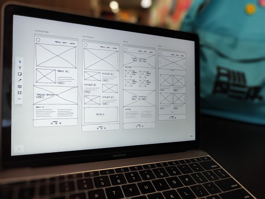
Your hero section is not a banner — it is your store’s opening argument. It needs to do three things immediately: communicate the product category, establish the brand tone, and give the visitor a clear next action. For ecommerce, that usually means a full-width image or video background with an overlay, a concise headline, a sub-line addressing the core benefit, and a primary CTA button that links directly to a category or featured product.
In Canvas, this is built as a section element with a background image set via the data-bg attribute and an overlay using Canvas’s built-in overlay utilities. Here is a working example you can adapt directly:
<section id="slider" class="slider-element min-vh-60 include-header" style="background: url('images/shop-hero.jpg') center/cover no-repeat;">
  <div class="slider-inner">
    <div class="vertical-middle">
      <div class="container">
        <div class="row justify-content-center text-center">
          <div class="col-lg-7">
            <div class="badge bg-color text-white ls-1 mb-3">New Arrivals 2025</div>
            <h2 class="display-4 fw-bold text-white mb-3">Gear Built for the Outdoors</h2>
            <p class="lead text-white op-8 mb-4">Explore our summer collection — lightweight, durable, and ready for anything.</p>
            <a href="shop.html" class="button button-xlarge button-rounded button-light">Shop the Collection</a>
          </div>
        </div>
      </div>
    </div>
  </div>
</section>
The Product Grid: Clarity Over Density
The product grid is where browsers become buyers — or leave. The most common mistake in ecommerce web design is packing too many products into a row to show volume. Four columns on desktop is generally the practical maximum before product images become too small to communicate quality. Three columns with generous card padding performs better on average order value because each product gets proper real estate.
Canvas’s Bootstrap 5 grid makes this straightforward. Each product card should include: product image, product name, price, a star rating row, and an add-to-cart or quick-view button. Keep the card background neutral so the product image carries the visual weight. The Bootstrap Grid Calculator is a useful reference when you need to verify column widths across breakpoints before committing to a layout.
<section id="products" class="section mb-0">
  <div class="container">
    <div class="row g-4">

      <div class="col-md-4">
        <div class="card border-0 shadow-sm h-100">
          <img src="images/product-01.jpg" class="card-img-top" alt="Trail Pack 30L">
          <div class="card-body">
            <h3 class="h6 mb-1">Trail Pack 30L</h3>
            <p class="text-muted small mb-2">$89.00</p>
            <a href="product.html" class="button button-small button-rounded button-border button-dark w-100">View Product</a>
          </div>
        </div>
      </div>

      <div class="col-md-4">
        <div class="card border-0 shadow-sm h-100">
          <img src="images/product-02.jpg" class="card-img-top" alt="Summit Shell Jacket">
          <div class="card-body">
            <h3 class="h6 mb-1">Summit Shell Jacket</h3>
            <p class="text-muted small mb-2">$149.00</p>
            <a href="product.html" class="button button-small button-rounded button-border button-dark w-100">View Product</a>
          </div>
        </div>
      </div>

      <div class="col-md-4">
        <div class="card border-0 shadow-sm h-100">
          <img src="images/product-03.jpg" class="card-img-top" alt="Merino Base Layer">
          <div class="card-body">
            <h3 class="h6 mb-1">Merino Base Layer</h3>
            <p class="text-muted small mb-2">$65.00</p>
            <a href="product.html" class="button button-small button-rounded button-border button-dark w-100">View Product</a>
          </div>
        </div>
      </div>

    </div>
  </div>
</section>
Social Proof: Trust Signals That Reduce Hesitation
Shoppers who are undecided look for signals that other people have made this purchase and were satisfied. A dedicated social proof section placed below the product grid — rather than buried on a separate reviews page — significantly reduces hesitation at the moment of consideration. This section should combine: star ratings with a review count, two or three short testimonial quotes, and optionally a UGC (user-generated content) image row showing real customers with the product.
In Canvas, you can use the built-in testimonials block and style it with a subtle background colour. Setting the section background to a light tint using --cnvs-themecolor at low opacity creates a visual break without disrupting the page’s typographic hierarchy. For a deeper look at how typography hierarchy shapes trust on pages like this, the Typography Hierarchy in HTML Templates: A Designer’s Playbook covers the principles in detail.
:root {
  --cnvs-themecolor: #2d6a4f;
  --cnvs-themecolor-rgb: 45, 106, 79;
  --cnvs-primary-font: 'Inter', sans-serif;
}

.section-social-proof {
  background-color: rgba(var(--cnvs-themecolor-rgb), 0.06);
  padding: 80px 0;
}
Urgency and Upsell Sections: The Revenue Multipliers
Two section types are consistently under-used in ecommerce HTML builds: urgency sections and upsell/cross-sell rows. An urgency section uses scarcity or time-limited offers to move hesitant browsers into a buying decision. A countdown timer, a “Only 4 left in stock” badge, or a free-shipping threshold banner placed between the product grid and the footer can lift conversion rates measurably.
An upsell row — “Frequently bought together” or “Complete the look” — placed after the featured products section increases average order value without requiring the visitor to navigate away. In Canvas, this is simply another section with a three or four-column grid using col-md-3 and compact product cards. Keep the section heading short and benefit-led: “People Also Buy” outperforms “Related Products” in most A/B tests because it implies social validation rather than algorithmic suggestion.
The What Is UI/UX Design? guide is a useful reference if you want to understand the behavioural reasoning behind why urgency and social proof sections work at a psychological level.
Brand Story and Values: The Section That Builds Loyalty
In 2025, customers increasingly buy from brands whose values they recognise, not just from stores with the lowest price. A brand story section — typically a two-column layout with a strong image left and concise copy right — gives your store a human dimension that product grids alone cannot provide. This section works particularly well for independent brands, sustainable product lines, and stores with a craft or artisan positioning.
Keep the copy tight: three short paragraphs maximum. Use a pull-quote or a bold stat to anchor the section visually. In Canvas, the col-lg-6 two-column split with an image fill on one side and vertically centred text on the other is clean and reliable across breakpoints. Use --cnvs-secondary-font for the pull-quote to create contrast without breaking the typographic system.
When you are building multiple page sections like these from scratch, Canvas Builder can generate the full section scaffolding — hero, product grid, social proof, urgency, and brand story — without requiring you to write every block manually, which is particularly valuable when prototyping for client approval or iterating on layout order quickly.
Frequently Asked Questions
What makes an ecommerce website HTML template different from a generic HTML template?
An ecommerce-specific HTML template includes pre-built section patterns designed for product display: product grids, cart interactions, size/variant selectors, review blocks, and urgency elements. A generic template requires you to build these patterns from scratch. The Canvas HTML Template is multi-purpose but includes enough layout flexibility to build all of these patterns using its Bootstrap 5 grid and component library.
How many products should I show on the homepage of an online store?
Six to twelve featured products is the standard range for a homepage grid. Showing fewer than six can make the store feel sparse; more than twelve creates decision fatigue. Segment them into meaningful groups — “New Arrivals,” “Best Sellers,” “Under $50” — so visitors can orient quickly rather than scanning an undifferentiated list.
Should I use a full-page layout or a single-page layout for an ecommerce store in Canvas?
For a multi-category store, a fullpagelayout with separate pages for the homepage, category pages, and product detail pages gives you the clearest information architecture. A singlepage layout works well for a focused product launch, a single-product store, or a coming-soon with waitlist. Most real ecommerce builds in Canvas use the fullpage_layout approach.
Can I customise the Canvas theme colour to match a specific brand without breaking the template?
Yes. Canvas uses the CSS variable --cnvs-themecolor at the root level. Overriding this variable in a custom CSS file — rather than editing the core stylesheet — changes the accent colour across buttons, links, and UI elements globally. Pair it with --cnvs-themecolor-rgb for components that use rgba() transparency, and your brand colour will propagate correctly.
What is the best section order for a high-converting ecommerce homepage?
A well-tested order is: Hero (value proposition and primary CTA) → Category navigation or featured collection strip → Featured product grid → Social proof / testimonials → Urgency or offer banner → Brand story or values section → Newsletter opt-in → Footer. This sequence moves visitors from awareness to desire to validation in a single scroll, which aligns with how online shoppers actually behave.
If you’re working with the Canvas HTML Template and want to generate production-ready layouts faster, try Canvas Builder free and see how much time you save on every project.
Build it by describing it
Canvas Builder turns a plain-English description into a complete, responsive website in minutes, then hands you the clean Bootstrap 5 HTML to host anywhere.