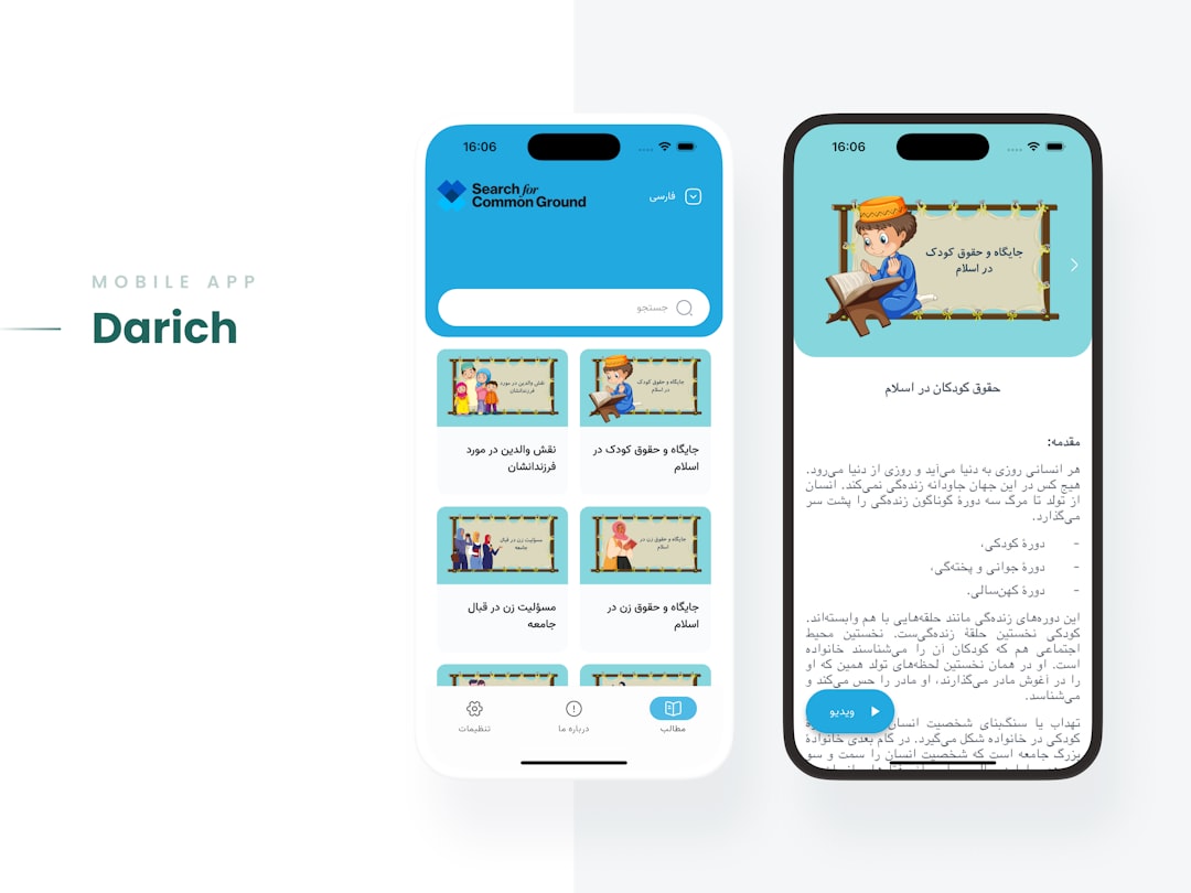
Your hero section has roughly three seconds to earn the visitor’s attention before they decide to scroll or leave. That makes it the single highest-stakes real estate on any webpage, yet most designers fill it with vague copy, stock photography, and a button that says “Learn More.”
- A high-performing hero section combines a clear value proposition, a single dominant call to action, and a visual hierarchy that guides the eye without confusion.
- Typography scale, contrast ratios, and whitespace do more conversion work than decorative imagery in most hero designs.
- Bootstrap 5 utility classes and Canvas CSS variables let you build production-ready hero sections without writing complex custom CSS from scratch.
- Small structural decisions, such as CTA button placement and headline length, measurably affect bounce rate and conversion.
What Actually Makes a Hero Section Work
A hero section works when it resolves the visitor’s immediate question: “Am I in the right place?” Answering that question requires three elements working together: a specific headline that names the outcome, supporting copy that qualifies who this is for, and a primary CTA that removes ambiguity about the next step. Everything else, background image, animation, icon set, is secondary.
Research on eye-tracking consistently shows an F-pattern or Z-pattern reading flow above the fold. Designing against those patterns means visitors process your message in the wrong order. Place your headline in the top-left or center, your supporting sentence directly beneath it, and your CTA button immediately below that. Do not make the eye hunt.
Visual hierarchy matters as much as copy. A headline set at 56px or larger on desktop, a subheadline at 20-22px, and a button with at least 8px vertical padding creates a clear reading sequence. If you are unsure which font combinations reinforce that hierarchy without clashing, the guide on best Google font pairings for web design covers which typeface combinations actually hold up at display sizes.
The Core HTML Structure for a Hero Section
Whether you are building from scratch or adapting an existing Canvas HTML Template, the structural markup for an effective hero follows the same pattern. Here is a working Bootstrap 5 hero section you can drop directly into any project:
<section class="section bg-dark text-white py-6">
  <div class="container">
    <div class="row align-items-center min-vh-75">
      <div class="col-lg-7">
        <p class="text-uppercase ls-2 mb-2 opacity-75">Launching 2026</p>
        <h1 class="display-4 fw-bold lh-sm mb-3">
          Build Landing Pages That Convert, Not Just Look Good
        </h1>
        <p class="lead mb-4 opacity-90">
          Generate production-ready Bootstrap 5 layouts in minutes with
          AI-powered block generation built for the Canvas HTML Template.
        </p>
        <div class="d-flex flex-wrap gap-3">
          <a href="/signup" class="btn btn-primary btn-lg px-4">Start Free Trial</a>
          <a href="#how-it-works" class="btn btn-outline-light btn-lg px-4">See How It Works</a>
        </div>
      </div>
      <div class="col-lg-5 mt-5 mt-lg-0">
        <img src="hero-visual.png" alt="Dashboard preview" class="img-fluid rounded-3 shadow-lg">
      </div>
    </div>
  </div>
</section>
Notice the structure: eyebrow label, headline, subheadline, dual CTA. The primary button uses a filled style; the secondary uses an outline. This pattern reduces decision paralysis while still offering an alternative path for visitors who need more information before committing.
Using Canvas CSS Variables for Hero Customisation
If you are building on the Canvas HTML Template, you have access to a set of CSS custom properties that give you consistent theming without overriding core styles. Customising a hero background and typography through these variables keeps your build upgrade-safe:
:root {
  --cnvs-themecolor: #4f46e5;
  --cnvs-themecolor-rgb: 79, 70, 229;
  --cnvs-primary-font: 'Inter', sans-serif;
  --cnvs-secondary-font: 'Playfair Display', serif;
  --cnvs-header-bg: rgba(0, 0, 0, 0.85);
  --cnvs-header-sticky-bg: #0d0d0d;
}

.hero-section {
  background-color: rgba(var(--cnvs-themecolor-rgb), 0.08);
  border-bottom: 2px solid var(--cnvs-themecolor);
  padding: 100px 0;
}

.hero-section h1 {
  font-family: var(--cnvs-secondary-font);
  color: #ffffff;
  font-size: clamp(2.25rem, 5vw, 3.5rem);
  line-height: 1.15;
}
Using clamp() for your headline font size means the hero scales fluidly across viewports without brittle breakpoint overrides. Pair this with a px to rem converter to keep your type scale consistent across the full layout.

Visual Hierarchy, Contrast, and Whitespace
A common mistake is treating the hero as a branding exercise rather than a conversion component. Designers add gradient overlays, animated particles, and multi-line taglines that compete for attention instead of directing it. Here is what the evidence actually supports:
- Headline contrast ratio should be at least 4.5:1 against its background (WCAG AA). Low contrast is the fastest way to lose readers with any level of visual impairment.
- Whitespace around the CTA increases click rates. A button crowded by text and icons requires more cognitive effort to identify as the primary action.
- Image placement on the right (desktop) is the most common high-converting layout because it leaves the left side, where Western readers start, clear for text.
- Single CTA beats dual CTA in most A/B tests unless you have a meaningful secondary audience (e.g., “Start Free” vs “Book a Demo” for a SaaS product with two buyer types).
Whitespace is not empty space; it is breathing room that prioritises what matters. The principles in the post on whitespace in web design apply directly to hero design, especially the argument for removing elements rather than adding them when conversion stalls.
The Most Common Hero Section Mistakes (and How to Fix Them)
After reviewing hundreds of templates and live sites, the same errors appear repeatedly. These are the ones that cause the most measurable conversion damage:
- Headline that describes the product, not the outcome. “AI-Powered Analytics Platform” tells the visitor what you built. “Know exactly where you’re losing revenue” tells them what they get. Rewrite every headline as a customer outcome.
- CTA label that says “Submit” or “Learn More.” Vague verbs reduce clicks. Use outcome-oriented labels: “Get My Free Report,” “Start Building Today,” “See Pricing.”
- Hero image that adds no information. A generic smiling team photo communicates nothing specific. A product screenshot, interface preview, or before/after comparison communicates value directly.
- No mobile-specific layout consideration. A 60/40 split column layout that looks great on desktop often stacks badly on mobile. Test your hero at 375px width before shipping.
- Auto-playing video backgrounds. These hurt performance (Core Web Vitals), distract from the headline, and can reduce conversions on slow connections. Use a static poster image with an optional play trigger instead.
For the CTA element specifically, the research behind call-to-action button design goes deeper into colour, sizing, and label psychology if you want to optimise beyond layout.
Generating Hero Sections Faster with Canvas Builder
Designing a hero from scratch takes time even when you know exactly what you want. Canvas Builder reduces that time significantly by letting you describe your layout in plain language and generating the corresponding Canvas HTML Template block, including correct Bootstrap 5 markup, Canvas CSS variable hooks, and responsive column structure, ready to paste into your project.
A prompt like “Create a dark hero section for a SaaS product with a left-aligned headline, two-button CTA group, and a right-side product screenshot” produces a complete, production-ready block rather than a starting-point wireframe. The output already uses the correct Canvas section type (block_section), correct JS references (js/plugins.min.js and js/functions.bundle.js), and correct CSS file references (style.css and css/font-icons.css), so you are not debugging asset paths before you can test the design.
If you want to understand how that workflow connects across a full page build, the post on prompt-to-production Canvas Builder workflow walks through a real example from brief to deployed layout.
Frequently Asked Questions
What is the ideal height for a hero section?
There is no single correct height. The goal is to display the headline, subheadline, and primary CTA above the fold on the most common viewport sizes (typically 768px to 900px tall on desktop). Using min-height: 80vh with flexbox centering is a reliable approach that scales across screen sizes without fixing a pixel value that breaks on ultrawide or small displays.
Should a hero section use a video background or a static image?
Static images almost always outperform video backgrounds on conversion metrics because they load faster and do not distract from the headline. Video backgrounds can work for brand-led campaigns where atmosphere matters more than direct response. If you use video, always provide a static poster image fallback, disable autoplay on mobile, and ensure the video file is under 2MB to protect Core Web Vitals scores.
How long should a hero headline be?
Aim for six to twelve words at display size. Shorter headlines force specificity and scan faster. If your value proposition genuinely needs more explanation, move the detail into the subheadline (one to two sentences maximum) rather than expanding the headline. Headlines longer than fifteen words at large font sizes create awkward line breaks on tablet and mobile viewports.
How do I make a hero section responsive in Bootstrap 5?
Use Bootstrap 5 column classes with responsive breakpoints: col-12 col-lg-7 for the text column and col-12 col-lg-5 for the image column. Stack vertically on mobile by default and switch to a side-by-side layout at the lg breakpoint (992px). Add mt-5 mt-lg-0 to the image column to control vertical spacing when stacked. Test at 375px, 768px, and 1280px as your three key checkpoints.
What Canvas section type should I use for a hero block?
For a standalone reusable hero component, use the blocksection type. If the hero is part of a complete single-page site, it lives within the singlepage layout type, positioned after the header and before the first content section. Never mix section types within the same layout file, as this breaks Canvas’s initialisation sequence for scroll animations and sticky header behaviour.
If you’re working with the Canvas HTML Template and want to generate production-ready layouts faster, try Canvas Builder free and see how much time you save on every project.