- Bootstrap 5’s grid system and utility classes give you a fast, mobile-first foundation for a professional restaurant website without writing excessive custom CSS.
- The Canvas HTML Template extends Bootstrap 5 with prebuilt sections, components, and CSS variables that dramatically accelerate restaurant site builds.
- Key restaurant website sections — hero, menu, gallery, reservations, and location — each have distinct layout and UX requirements that Bootstrap handles cleanly when structured correctly.
- Using CSS custom properties alongside Canvas variables keeps your brand colours and typography consistent across every section without repetitive overrides.
Why Bootstrap 5 Is a Strong Choice for Restaurant Websites
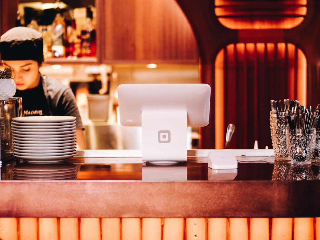
Restaurant websites have a specific set of requirements: they need to load fast on mobile (most bookings happen on phones), display food photography beautifully, and make core actions — viewing the menu, making a reservation, finding the address — effortless. Bootstrap 5 addresses all three through its mobile-first grid, responsive image utilities, and flexible component library.
The removal of jQuery in Bootstrap 5 also means leaner JavaScript, which contributes directly to faster page loads — a ranking factor that matters when local diners are searching for somewhere to eat tonight. Paired with the Canvas HTML Template and Canvas Builder, you can generate production-ready layout scaffolding in minutes rather than hours.
If you are deciding between a single-page and multi-page structure for your restaurant site, the post on Canvas One Page Demo vs Multi-Page: When to Use Each Format covers the trade-offs in useful detail.
Project Structure and Canvas Setup
Start with Canvas’s standard file structure. Your root directory should include style.css, css/font-icons.css, js/plugins.min.js, and js/functions.bundle.js. Never load Bootstrap from a CDN separately — Canvas bundles Bootstrap 5 internally, so a separate CDN import will cause conflicts.
A clean base HTML shell for a restaurant page looks like this:
<!DOCTYPE html>
<html lang="en">
<head>
  <meta charset="UTF-8">
  <meta name="viewport" content="width=device-width, initial-scale=1">
  <title>Ember & Oak — Modern Grill</title>
  <link rel="stylesheet" href="css/font-icons.css">
  <link rel="stylesheet" href="style.css">
  <style>
    :root {
      --cnvs-themecolor: #c0392b;
      --cnvs-primary-font: 'Playfair Display', serif;
      --cnvs-secondary-font: 'Inter', sans-serif;
      --cnvs-logo-height: 52px;
      --cnvs-logo-height-sticky: 40px;
    }
  </style>
</head>
<body>
  <!-- header, sections, footer go here -->
  <script src="js/plugins.min.js"></script>
  <script src="js/functions.bundle.js"></script>
</body>
</html>
Notice that –cnvs-themecolor sets the brand accent (a deep restaurant red in this case), and logo sizing is handled entirely through –cnvs-logo-height and –cnvs-logo-height-sticky — not by targeting #logo img directly.
Hero Section: Full-Bleed Food Photography
The hero is the most conversion-critical section on a restaurant site. A full-bleed background image with an overlay, a short headline, and two clear CTAs (View Menu, Book a Table) is the proven pattern. Bootstrap’s position utilities and Canvas’s section classes make this straightforward:
<section class="section py-0 min-vh-75 d-flex align-items-center"
         style="background: url('images/hero-grill.jpg') center/cover no-repeat;">
  <div class="overlay" style="background: rgba(0,0,0,0.52);"></div>
  <div class="container position-relative text-white text-center">
    <h1 class="display-3 fw-bold mb-3">Fire-Kissed Flavour,<br>Every Evening</h1>
    <p class="lead mb-5">Open Tuesday to Sunday, 5 pm — 11 pm</p>
    <a href="#menu" class="btn btn-lg me-3"
       style="background-color: var(--cnvs-themecolor); border:none; color:#fff;">
      View Menu
    </a>
    <a href="#reservations" class="btn btn-lg btn-outline-light">
      Book a Table
    </a>
  </div>
</section>
The min-vh-75 class ensures the hero occupies at least 75% of the viewport on every screen size. Using var(--cnvs-themecolor) on the primary button keeps the brand colour consistent without hardcoding a hex value in multiple places.
Menu Section: Building a Readable Grid Layout
Restaurant menus on the web fail most often because of poor information hierarchy. A two-column card grid on desktop that collapses to a single column on mobile is the correct starting point. Bootstrap’s col-md-6 and col-lg-4 modifiers handle this without a single media query in your custom CSS.
<section id="menu" class="section">
  <div class="container">
    <div class="row justify-content-center mb-5">
      <div class="col-lg-6 text-center">
        <h2 class="mb-2">Our Menu</h2>
        <p class="text-muted">Seasonal ingredients, prepared simply and well.</p>
      </div>
    </div>
    <div class="row g-4">
      <div class="col-md-6 col-lg-4">
        <div class="card border-0 shadow-sm h-100">
          <img src="images/ribeye.jpg" class="card-img-top" alt="Dry-Aged Ribeye">
          <div class="card-body">
            <div class="d-flex justify-content-between align-items-start">
              <h5 class="card-title mb-1">Dry-Aged Ribeye</h5>
              <span class="fw-bold" style="color: var(--cnvs-themecolor);">$48</span>
            </div>
            <p class="card-text text-muted small">
              28-day aged, served with truffle butter and roasted heritage carrots.
            </p>
          </div>
        </div>
      </div>
      <!-- Repeat .col-md-6.col-lg-4 blocks for additional dishes -->
    </div>
  </div>
</section>
The g-4 gutter class on the row provides consistent spacing between cards. Using Bootstrap’s shadow-sm and border-0 keeps cards clean without heavy styling. For more complex image-heavy layouts, the CSS Box Shadow Generator lets you dial in the exact shadow depth before committing it to your stylesheet.
Reservations and Contact: Converting Intent into Bookings
A reservation form needs to be short, clear, and reassuring. Date, time, party size, name, and phone number are the only fields that matter at this stage. Everything else creates friction. Use Bootstrap’s form-control and form-select classes for consistent styling, and wrap the form in a row with a location/map column beside it on larger screens:
<section id="reservations" class="section bg-light">
  <div class="container">
    <div class="row g-5 align-items-center">
      <div class="col-lg-6">
        <h2 class="mb-4">Reserve Your Table</h2>
        <form>
          <div class="row g-3">
            <div class="col-sm-6">
              <label class="form-label">Full Name</label>
              <input type="text" class="form-control" placeholder="Jane Smith">
            </div>
            <div class="col-sm-6">
              <label class="form-label">Phone</label>
              <input type="tel" class="form-control" placeholder="+1 555 000 0000">
            </div>
            <div class="col-sm-6">
              <label class="form-label">Date</label>
              <input type="date" class="form-control">
            </div>
            <div class="col-sm-6">
              <label class="form-label">Guests</label>
              <select class="form-select">
                <option>1</option>
                <option>2</option>
                <option>3–4</option>
                <option>5+</option>
              </select>
            </div>
            <div class="col-12">
              <button type="submit" class="btn w-100 py-3 fw-semibold text-white"
                      style="background-color: var(--cnvs-themecolor);">
                Confirm Reservation
              </button>
            </div>
          </div>
        </form>
      </div>
      <div class="col-lg-6">
        <iframe
          src="https://www.google.com/maps/embed?pb=!1m18!..."
          width="100%" height="380"
          style="border:0; border-radius: 12px;"
          allowfullscreen loading="lazy">
        </iframe>
      </div>
    </div>
  </div>
</section>
The two-column layout — form on the left, embedded map on the right — is a high-performing pattern for local businesses because it satisfies both conversion intent and location discovery in one section. For similar food-sector project approaches, the post on How to Design a Meal Kit Subscription Website with Canvas shows how these section patterns adapt across food industry niches.
Performance and SEO: Finishing Touches That Matter in 2025
A technically sound restaurant site needs a few non-negotiable finishing touches before launch:
- Lazy-load all food images using
loading="lazy"on every<img>tag below the fold. This alone can cut initial page load time significantly on image-heavy menu sections. - Add structured data (JSON-LD) with
@type: Restaurantso Google can display opening hours, cuisine type, and star ratings directly in search results. - Use descriptive alt text on every food image — “dry-aged ribeye with truffle butter” outperforms “dish1.jpg” for both accessibility and image search.
- Compress images to WebP format. A hero image at 2500px wide should weigh under 200 KB in WebP with quality set to 80.
- Set a canonical URL if your menu is accessible from multiple paths, to avoid duplicate content penalties.
The Food Tech Website Design Trends and Best Practices for 2026 post covers how performance expectations for food-sector sites continue to rise alongside mobile usage, which makes these optimisations non-optional for competitive local search.
Frequently Asked Questions
Do I need to know Bootstrap 5 in depth to build a restaurant site with Canvas?
No. Canvas abstracts most of Bootstrap 5’s complexity into prebuilt section types and Canvas-specific utility classes. A working knowledge of Bootstrap’s grid system — rows, columns, and responsive Bootstrap breakpoint tester modifiers — is sufficient for most restaurant site builds.
Which Canvas section type is best for a restaurant website?
A singlepage section type works well for most restaurant sites — it keeps the header, hero, menu, reservations, and footer in a single scrollable experience that converts well on mobile. If the restaurant has multiple locations or a large menu, a fullpage_layout with internal navigation may be more appropriate.
How do I change the theme colour across the entire site without editing every element?
Set –cnvs-themecolor once in the :root block of your stylesheet. Every Canvas component and any custom elements that reference var(--cnvs-themecolor) will update automatically. This is far more maintainable than hardcoding a hex value repeatedly.
Can I add an online ordering system or booking widget to a Bootstrap 5 restaurant site?
Yes. Third-party booking platforms like OpenTable or Resy provide embeddable iframes or JavaScript widgets that integrate cleanly into any Bootstrap 5 layout. Place the widget code inside a standard Bootstrap container and grid column to ensure it remains responsive.
What is the recommended image format for restaurant food photography on a Canvas site?
WebP is the recommended format in 2025 for its combination of quality and file size. Use a <picture> element with a WebP source and a JPEG fallback for older browsers. Hero images should be compressed to under 200 KB and all below-fold images should carry the loading="lazy" attribute.
If you’re working with the Canvas HTML Template and want to generate production-ready layouts faster, try Canvas Builder free and see how much time you save on every project.