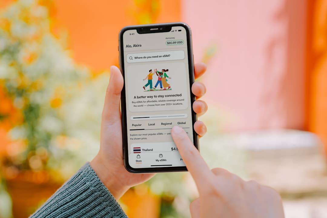
An app download landing page has one job: get the visitor to tap or click install before they scroll away, get distracted, or talk themselves out of it. Most pages fail that job because they borrow the structure of a marketing brochure instead of designing around the moment of decision.
- A high-converting app download landing page leads with a single, device-specific call to action above the fold — everything else is supporting evidence.
- Social proof, app store ratings, and screenshot carousels reduce friction and build the confidence users need before they commit to an install.
- The Canvas HTML Template gives you a production-ready foundation for mobile app landing pages without building component by component from scratch.
- Page speed and mobile responsiveness are not optional — app users are already on their phones, and a slow or broken page will cost you the install.
What Belongs Above the Fold
The first screenful of your app landing page determines whether the visitor stays or bounces. For an app download landing page, the above-the-fold area needs to answer three questions instantly: what does this app do, who is it for, and where can I get it?
That means your hero section needs a concise headline (not a tagline — a plain-language description of the core benefit), a supporting subheading that adds one layer of context, a rendered phone mockup or short looping video, and your App Store and Google Play badge links. Nothing else belongs here. Navigation menus, feature grids, and testimonials carousels all belong below the fold where they serve as supporting evidence after the visitor has decided they are interested.
Using Canvas, a Bootstrap 5 hero section with stacked CTA badges looks like this:
<section id="hero" class="py-6 bg-light">
  <div class="container">
    <div class="row align-items-center">
      <div class="col-lg-6">
        <h2 class="display-4 fw-bold mb-3">Track Every Run. Own Every Goal.</h2>
        <p class="lead mb-4">Pace Pro gives runners real-time coaching, personalised training plans, and race-day insights — all in one app.</p>
        <div class="d-flex flex-wrap gap-3">
          <a href="#ios-link" class="button button-rounded button-large">
            <i class="fa-brands fa-apple me-2"></i>App Store
          </a>
          <a href="#android-link" class="button button-rounded button-large button-border">
            <i class="fa-brands fa-google-play me-2"></i>Google Play
          </a>
        </div>
      </div>
      <div class="col-lg-6 text-center mt-5 mt-lg-0">
        <img src="images/app-mockup.png" alt="Pace Pro app screenshot" class="img-fluid">
      </div>
    </div>
  </div>
</section>
Presenting Features Without Overwhelming Visitors
Feature sections are where most app landing page designs go wrong. Developers list every capability the app has. Users only care about the three or four things that are relevant to the problem they are trying to solve. The rule for 2025 and beyond is simple: lead with outcomes, not features.
Instead of “Advanced route mapping algorithm,” write “Never get lost on a trail again.” Instead of “Biometric data integration,” write “See your heart rate, pace, and elevation in one glance.” Each feature point should map to a specific frustration or desire your target user already has.
Structurally, a three-column icon grid using Bootstrap 5 works well here. Keep each item to one icon, one short headline, and two sentences maximum:
<section id="features" class="py-6">
  <div class="container">
    <div class="row g-4 text-center">
      <div class="col-md-4">
        <div class="feature-box">
          <i class="bi bi-lightning-charge fs-1 text-primary mb-3 d-block"></i>
          <h3 class="h5 fw-semibold">Real-Time Coaching</h3>
          <p class="text-muted">Audio cues and pace alerts keep you on target without ever glancing at your screen.</p>
        </div>
      </div>
      <div class="col-md-4">
        <div class="feature-box">
          <i class="bi bi-calendar-check fs-1 text-primary mb-3 d-block"></i>
          <h3 class="h5 fw-semibold">Personalised Plans</h3>
          <p class="text-muted">Training schedules built around your goal race, current fitness level, and available days.</p>
        </div>
      </div>
      <div class="col-md-4">
        <div class="feature-box">
          <i class="bi bi-bar-chart-line fs-1 text-primary mb-3 d-block"></i>
          <h3 class="h5 fw-semibold">Race-Day Insights</h3>
          <p class="text-muted">Post-run breakdowns that tell you exactly where you gained or lost time.</p>
        </div>
      </div>
    </div>
  </div>
</section>
If your app has more than six key features, consider a tabbed layout or a scrolling alternating-row section rather than expanding the grid. The 10 Canvas HTML Template sections every landing page needs post covers alternating feature rows in more detail.
Screenshot Carousels That Build Confidence
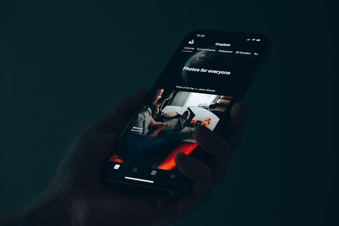
App screenshots are your most persuasive selling tool because they show, rather than tell. A well-structured screenshot Bootstrap carousel lets visitors mentally place themselves inside the app before they download it. The goal is to reduce the uncertainty that stops someone tapping install.
Canvas includes multiple slider and carousel components. For a mobile app HTML template context, a horizontal scrolling screenshot strip inside phone frame mockups works better than a full-width hero slider. Keep autoplay off or set a slow interval — forcing users through slides at pace feels patronising. For guidance on choosing the right carousel style for your layout, the Canvas Slider and Carousel Components guide is worth reading before you decide.
One practical tip: order your screenshots by the user journey, not by what looks impressive in isolation. Show the onboarding screen, then the core dashboard, then a results or achievement screen. That narrative arc mirrors the experience the visitor is about to have, which makes the decision to install feel less like a leap of faith.
Social Proof: Ratings, Reviews, and Download Numbers
Social proof on an app landing page works differently from an agency portfolio or SaaS homepage. Visitors are not evaluating your company — they are assessing whether this specific app is worth the storage space and the learning curve. That means your social proof needs to be app-centric and specific.
The most effective elements to include, in rough order of impact, are:
- App store star rating displayed as a visual star row with the review count alongside it
- Short user quotes that mention a specific outcome (“I knocked four minutes off my 10k in six weeks”)
- Download milestone if you have reached a round number worth stating (100,000+ downloads)
- Press mentions if relevant publications have covered the app
Avoid generic testimonials like “Great app, highly recommend.” They add length without adding credibility. If your user reviews are thin, focus on the star rating and a single strong quote rather than padding with weak ones. The same principle applies to any conversion-focused page — a point covered in depth in the post on SaaS website design and B2B homepage conversion.
Mobile Performance and Page Speed
The users visiting your app download landing page are disproportionately on mobile devices. A page that loads slowly on a 4G connection will bleed installs. Canvas is built on Bootstrap 5 and loads efficiently, but the assets you add on top of the template — particularly phone mockup images and looping video backgrounds — can erode that performance quickly.
Practical steps to keep your page fast:
- Export phone mockup images as WebP with a maximum width of 600px at 2x — they will look sharp on retina displays without being oversized
- Load Canvas JS files
js/plugins.min.jsandjs/functions.bundle.jsat the bottom of the body, never in the head - Defer any third-party analytics scripts so they do not block the first contentful paint
- Use the
loading="lazy"attribute on all below-the-fold images - Test your page with Google PageSpeed Insights and target a mobile score above 85 before launch
Canvas’s CSS variables generator also let you make global style changes with a single declaration. Swapping the theme colour for your brand colour is a one-line change that keeps your page feeling native to your app’s visual identity:
:root {
  --cnvs-themecolor: #e8431a;
  --cnvs-themecolor-rgb: 232, 67, 26;
}
CTA Placement: Repeat the Install Button at the Right Moments
A single CTA at the top of the page is not enough for visitors who scroll through your full content before deciding. The principle of progressive commitment means that some visitors need to read the features section, scan the reviews, and see the screenshots before they are ready to act. If your download button only appears in the hero, those visitors reach the bottom of the page with no obvious next step.
Place your App Store and Google Play buttons in at least three locations: the hero section, immediately after the screenshot carousel or social proof block, and in the footer. If your page is long, consider a sticky bottom bar on mobile that stays visible as the user scrolls. This is especially effective for app landing pages because the action — tapping a store badge — is a single tap that takes seconds, unlike a form submission.
Keep the button copy consistent and action-oriented. “Download Free” outperforms “Get the App” because it answers the implicit question “will this cost me anything?” before the visitor has to ask. Small copy decisions at the CTA level have measurable effects on conversion rates, and this applies whether you are building an app landing page, an agency portfolio, or any other conversion-focused page.
Frequently Asked Questions
Should an app download landing page link to both the App Store and Google Play?
Yes, unless your app is genuinely platform-exclusive. Show both badges prominently and use device detection if you want to surface the relevant store first — but always keep both visible so users on the other platform are not excluded.
How long should an app landing page be?
Long enough to answer every objection a first-time visitor might have, and no longer. For most apps, that means a hero, a feature section, a screenshot carousel, social proof, and a closing CTA — roughly four to six sections on a single-page layout. Avoid padding the page with content that does not serve the install decision.
Is Canvas HTML Template suitable for a mobile app landing page?
Yes. Canvas includes app-focused demo layouts and all the component types you need — hero sections, icon grids, carousels, testimonial blocks, and CTA rows. Because it is built on Bootstrap 5, everything is responsive by default, which matters significantly for a page primarily viewed on mobile devices.
What is the best way to show app screenshots on a landing page?
Wrap screenshots in device frame mockups and present them in a horizontally scrollable carousel or a static three-up row. Order them to follow the user journey from onboarding to core feature to outcome, rather than selecting screens based purely on visual appeal.
How do I track installs driven by my landing page?
Use UTM parameters on your App Store and Google Play links so you can attribute installs to your landing page traffic in analytics. Both platforms also support custom referral tracking through their respective developer consoles, which gives you more granular data on which page sections drove the most clicks.
If you’re working with the Canvas HTML Template and want to generate production-ready layouts faster, try Canvas Builder free and see how much time you save on every project.
Build it by describing it
Canvas Builder turns a plain-English description into a complete, responsive website in minutes, then hands you the clean Bootstrap 5 HTML to host anywhere.