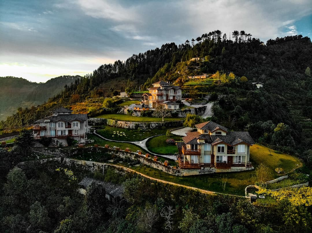
High-net-worth buyers make snap judgements about a property before they ever speak to an agent, and those judgements are formed entirely by what they see on screen. A luxury property website that looks generic, loads slowly, or buries its best photography will lose qualified buyers in seconds, regardless of how spectacular the listing actually is.
- Luxury property websites require a distinct visual language: restrained colour palettes, editorial typography, and cinematic imagery that signals prestige immediately.
- Performance and mobile responsiveness are non-negotiable, because affluent buyers frequently browse on high-resolution devices and expect flawless presentation.
- The right Bootstrap 5 framework, such as the Canvas HTML Template, gives developers a structurally sound base that can be styled to match high-end brand standards without rebuilding from scratch.
- Every element from hero sections to contact forms should reinforce one message: this brand is authoritative, discreet, and worth the price.
A Cinematic Hero Section That Commands Attention
The hero section is where the first impression lives. For luxury real estate, that means full-viewport imagery or video, no clutter, and a headline that is confident rather than salesy. The goal is to evoke a feeling before a buyer reads a single specification.
Full-width video backgrounds of a property at golden hour, paired with a single italic serif headline and a minimal CTA, outperform traditional property-photo carousels in time-on-site metrics. Keep overlay opacity light enough to preserve the visual richness of the asset beneath it. For a deeper look at what makes hero sections perform, read How to Design Hero Sections That Grab Attention Instantly.
In Canvas, the hero section structure using Bootstrap 5 looks like this:
<section class="section mb-0 py-0" style="background: url('assets/images/property-hero.jpg') center/cover no-repeat; min-height: 100vh;">
  <div class="container h-100 d-flex align-items-center">
    <div class="row">
      <div class="col-lg-7">
        <span class="text-white ls-2 fw-light d-block mb-3" style="font-family: var(--cnvs-secondary-font); font-size: 0.85rem; letter-spacing: 0.25em; text-transform: uppercase;">Exclusive Collection</span>
        <h2 class="display-3 text-white fw-light mb-4" style="font-family: var(--cnvs-secondary-font);">Residences Defined by Rarity</h2>
        <a href="#featured" class="button button-border border-light text-white ls-1">View Properties</a>
      </div>
    </div>
  </div>
</section>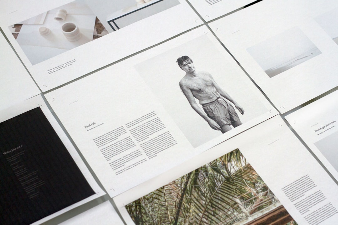
Editorial Typography That Signals Prestige
Typography in luxury design is not decorative. It communicates brand authority at a glance. The combination that consistently works in prestige real estate is a refined serif for headlines paired with a geometric or humanist sans-serif for body copy. Think of how architectural magazines use type: generous white space, restrained weights, deliberate hierarchy.
In Canvas, you control typeface choices through the –cnvs-primary-font and –cnvs-secondary-font CSS variables. Setting these site-wide means every component inherits the brand identity automatically, with no per-element overrides needed.
:root {
  --cnvs-primary-font: 'Cormorant Garamond', Georgia, serif;
  --cnvs-secondary-font: 'Jost', 'Helvetica Neue', sans-serif;
  --cnvs-themecolor: #9a7d5a; / warm gold accent /
  --cnvs-themecolor-rgb: 154, 125, 90;
}
Cormorant Garamond at light weight for display headings and Jost for navigation and body copy is a pairing that reads as contemporary luxury. For a full breakdown of font pairings that suit prestige brands in 2026, see Best Google Font Pairings for Web Design (2026).
A Restrained Colour Palette With a Single Accent
Luxury websites use colour with discipline. The palette is typically near-white or warm off-white backgrounds, deep charcoal or muted navy for text, and one carefully chosen accent, usually a gold, bronze, or dusty sage, applied sparingly to CTAs, underlines, and hover states.
Avoid bright primary colours, gradient backgrounds, and anything that could appear on a budget real estate portal. The accent colour, set through –cnvs-themecolor, should appear only at decision points: buttons, active navigation items, and icon highlights. Overusing it destroys the hierarchy.
A disciplined CSS variable setup for a luxury palette:
:root {
  --cnvs-themecolor: #b09060;
  --cnvs-themecolor-rgb: 176, 144, 96;
  --cnvs-header-bg: #ffffff;
  --cnvs-header-sticky-bg: rgba(255, 255, 255, 0.97);
  --cnvs-primary-menu-color: #2a2a2a;
  --cnvs-primary-menu-hover-color: #b09060;
}

body {
  background-color: #faf9f7;
  color: #2a2a2a;
}
A Property Showcase Layout Built for High-Resolution Imagery
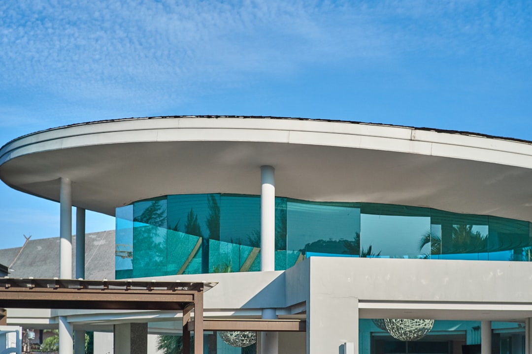
Listing grids on luxury property websites should feel like gallery previews, not search results. Each card needs space to breathe: generous padding, large imagery, subtle hover transitions, and minimal text overlay. Avoid crowding price, beds, and baths into a cramped footer strip. Instead, reveal details progressively on hover or on a dedicated property page.
Using Bootstrap 5 columns inside Canvas, a clean luxury listing grid looks like this:
<div class="row g-5">
<div class="col-lg-6">
<div class="property-card position-relative overflow-hidden">
<img src="assets/images/listing-01.jpg" alt="Mayfair Penthouse" class="w-100" style="aspect-ratio: 4/3; object-fit: cover; transition: transform 0.6s ease;">
<div class="pt-4">
<span class="d-block text-uppercase ls-3 mb-1" style="font-size: 0.7rem; color: var(--cnvs-themecolor); letter-spacing: 0.2em;">Mayfair, London</span>
<h3 class="h5 fw-light mb-1" style="font-family: var(--cnvs-primary-font);">The Grosvenor Penthouse</h3>
<p class="text-muted mb-0" style="font-size: 0.85rem;">4 Beds · 3 Baths · 3,200 sq ft</p>
</div>
</div>
</div>
<div class="col-lg-6">
<!-- Additional listing card -->
</div>
</div>For the correct Bootstrap grid setup, the Bootstrap Grid Calculator can help you plan column ratios and gutters before writing a line of code.
Trust and Credibility Signals That Justify Premium Pricing
Affluent buyers are cautious buyers. Before they contact an agent, they want evidence of track record, market knowledge, and discretion. Credibility signals on a luxury property website must feel earned, not manufactured.
The most effective trust elements for prestige real estate sites include:
- Press and award logos from recognised publications (Financial Times, Architectural Digest, property industry bodies), displayed in a monochrome strip to avoid visual noise.
- Testimonials with full names, not initials, formatted as editorial pull quotes rather than star-rating widgets.
- Transaction volume statistics such as “GBP 2.4bn in completed sales since 2010,” presented in large, clean numerals with a brief descriptor.
- Agent profiles with professional portrait photography, credentials, and market specialisations, not a generic team grid.
- A discreet off-market section accessible only after registration, which signals exclusivity and encourages lead capture.
Avoid third-party review widgets that look like consumer e-commerce. The visual language should stay consistent with the editorial tone of the rest of the site.
Lead Capture and Enquiry Forms That Respect the Buyer
Contact forms on luxury property websites should be brief, unintimidating, and framed as a private conversation rather than a data collection exercise. A form that asks for name, email, phone, and a free-text enquiry field is sufficient. Multi-step forms with progress indicators can work well for qualifying buyers without feeling bureaucratic.
The section background, button styling, and form layout should stay consistent with your established palette. The CTA button should use –cnvs-themecolor as the background and never use stock phrases like “Submit” or “Send.” Use “Request a Private Viewing” or “Begin Your Enquiry” instead.
<section class="section bg-transparent">
  <div class="container">
    <div class="row justify-content-center">
      <div class="col-lg-6 text-center mb-5">
        <span class="d-block text-uppercase ls-3 mb-2" style="font-size: 0.75rem; color: var(--cnvs-themecolor); letter-spacing: 0.2em;">Private Enquiries</span>
        <h2 class="h3 fw-light" style="font-family: var(--cnvs-primary-font);">Speak With an Advisor</h2>
      </div>
    </div>
    <div class="row justify-content-center">
      <div class="col-lg-5">
        <form>
          <div class="mb-4">
            <input type="text" class="form-control form-control-lg border-0 border-bottom rounded-0 px-0" placeholder="Your Name" style="background: transparent; border-color: #ccc !important;">
          </div>
          <div class="mb-4">
            <input type="email" class="form-control form-control-lg border-0 border-bottom rounded-0 px-0" placeholder="Email Address" style="background: transparent; border-color: #ccc !important;">
          </div>
          <div class="mb-5">
            <textarea class="form-control border-0 border-bottom rounded-0 px-0" rows="3" placeholder="Your Enquiry" style="background: transparent; border-color: #ccc !important; resize: none;"></textarea>
          </div>
          <button type="submit" class="btn w-100 py-3 text-white" style="background-color: var(--cnvs-themecolor); letter-spacing: 0.15em; font-size: 0.8rem; text-transform: uppercase;">Request a Private Viewing</button>
        </form>
      </div>
    </div>
  </div>
</section>
For broader principles on converting high-intent visitors with well-designed forms and CTAs, the post on Lead Generation Landing Pages: 7 Principles That Maximise Opt-Ins covers the psychology behind form friction in detail.
Frequently Asked Questions
What makes a property website look truly luxurious rather than just expensive?
True luxury design is characterised by restraint, not extravagance. White space, a controlled two-font system, a single accent colour, and cinematic photography do more for perceived prestige than elaborate animations or ornate graphic elements. Every decision should reduce cognitive load, not increase it.
Should a luxury property website show prices publicly?
This depends on market norms and brand strategy. Many ultra-prime agencies use “Price on Application” or “Available on Request” as a deliberate signal of exclusivity. If prices are shown, they should be formatted cleanly with no cluttered surrounding data, and always displayed in context (per annum, per week, or purchase price) to avoid ambiguity.
How important is page speed for a luxury property website?
Critically important. High-net-worth buyers frequently browse on premium devices with high expectations for performance. A slow-loading hero video or unoptimised gallery will be interpreted as a lack of professionalism. Compress images with modern formats such as WebP, lazy-load off-screen content, and keep third-party scripts to a minimum.
Is the Canvas HTML Template suitable for building a luxury property website?
Yes. Canvas is built on Bootstrap 5, which provides a responsive, structured grid system that is well-suited to property layouts. Its CSS variables, particularly –cnvs-themecolor, –cnvs-primary-font, and –cnvs-secondary-font, allow precise brand customisation without fighting the framework. The template also includes a wide range of pre-built section types that can be styled to luxury standards.
How many listings should appear on the homepage of a luxury property website?
Feature between two and six listings on the homepage, curated as a “collection” rather than a searchable index. The goal is to showcase the quality of inventory, not the quantity. A prominent “View All Properties” link routes buyers to a full, filterable listings page where volume is appropriate.
If you’re working with the Canvas HTML Template and want to generate production-ready layouts faster, try Canvas Builder free and see how much time you save on every project.