The fitness industry has always moved fast — and in 2026, its websites are keeping pace. Members no longer just want a place to find class schedules; they expect an experience that motivates them before they even step through the door. Whether you’re building a boutique gym site, an online workout platform, or a personal trainer’s digital home, the stakes for great design have never been higher.
Looking for the best dark mode fitness app and dashboard designs for 2026? This guide breaks down the UI patterns behind today’s highest-converting fitness products — dark-mode dashboards, mobile app screens, and gym websites — with the exact color systems, typography, and layout ideas you can copy. Every section pairs a design principle with practical, copy-paste code so you can ship the look, not just admire it.
What Makes a Great Dark Mode Fitness Dashboard Design in 2026
The strongest dark mode fitness dashboards in 2026 share four traits: a near-black (not pure black) base like #0B0B0F to reduce eye strain, a single high-energy accent (electric lime, neon orange, or cyan) reserved for progress and CTAs, oversized numeric typography for live stats (heart rate, reps, calories), and generous spacing so workout data never feels cramped. The patterns below show how to apply each one.
This guide breaks down the most important fitness website design trends shaping 2026 — with practical code you can use today. From bold typography to AI-powered personalisation, here’s what’s winning in the gym space right now.
⚡ Key Takeaways
- Bold, kinetic typography is replacing static hero images as the primary attention hook on gym websites.
- Dark-mode-first layouts project energy and reduce eye strain during evening browsing sessions.
- Micro-interactions and progress animations drive higher engagement on workout platform dashboards.
- AI-powered personalisation (content, class recommendations, pricing) is becoming table-stakes for fitness platforms.
- Mobile-first, thumb-friendly navigation is non-negotiable — most fitness traffic arrives via smartphone.
- Social proof sections (live class counts, member stats, real-time activity feeds) significantly increase trust and conversion.
1. Bold, Kinetic Typography Takes Centre Stage
Gone are the days of a hero image with a modest subtitle. In 2026, the best gym website designs lead with oversized, expressive type — words that practically vibrate with energy before a single photo loads. Think full-viewport headings at 96px–120px, variable-weight fonts that shift on scroll, and text animations that feel athletic, not gimmicky.
The reasoning is simple: bold type loads faster than video backgrounds, works perfectly on mobile, and sets tone in milliseconds. Brands like Barry’s and Mirror have already proved that words are the visual.
Here’s a minimal Bootstrap 5 hero using a display utility class and a CSS animation to give text that kinetic feel:
<!-- Kinetic Typography Hero -->
<section class="d-flex align-items-center justify-content-center text-center
                bg-dark text-white" style="min-height:100vh;">
  <div class="container">
    <h1 class="display-1 fw-black text-uppercase lh-1 hero-pulse">
      Train Harder.<br>
      <span class="text-warning">Live Stronger.</span>
    </h1>
    <p class="lead mt-4 text-white-50">Join 12,000 members crushing goals every day.</p>
    <a href="#plans" class="btn btn-warning btn-lg mt-3 px-5">Start Free Trial</a>
  </div>
</section>

<style>
  @import url('https://fonts.googleapis.com/css2?family=Inter:wght@900&display=swap');

  .hero-pulse {
    font-family: 'Inter', sans-serif;
    animation: pulse 3s ease-in-out infinite;
  }

  @keyframes pulse {
    0%, 100% { letter-spacing: -0.02em; }
    50%       { letter-spacing:  0.04em; }
  }
</style>
Pair this pattern with Bootstrap 5 Typography: Font Sizes, Weights, and Display Classes for a deeper look at how to control hierarchy across the whole page.
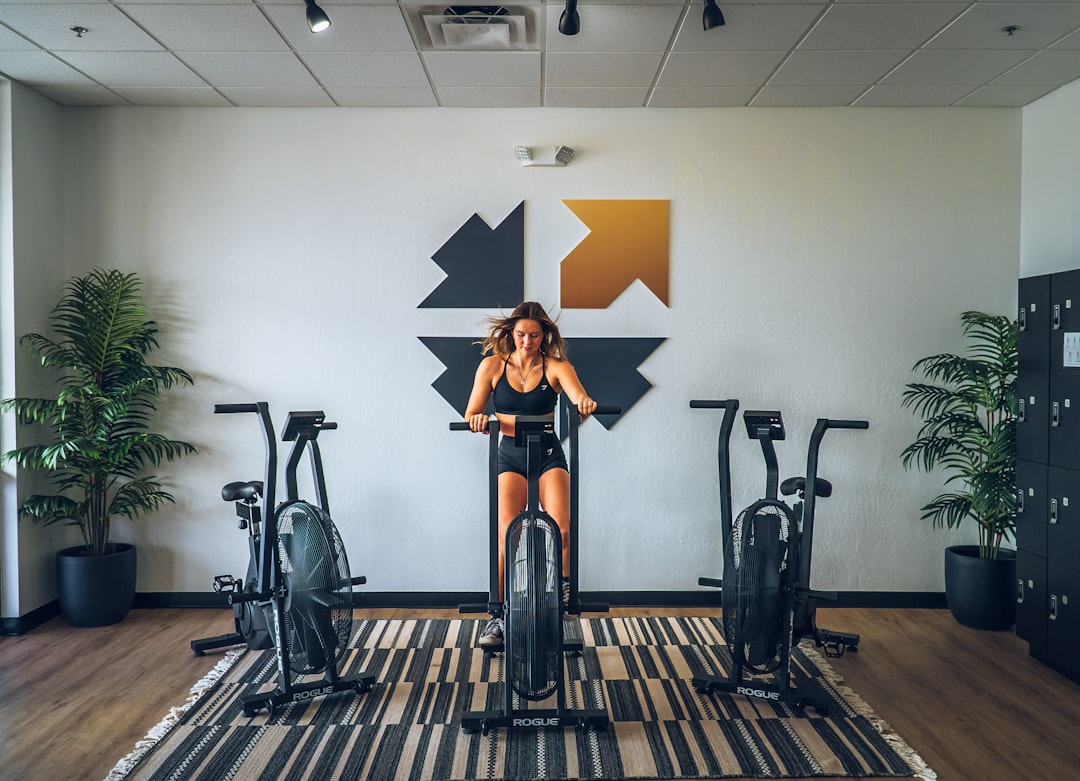
2. Dark-Mode-First Layouts That Radiate Energy
Light websites feel clinical. Dark websites feel powerful — and that psychological contrast is exactly why dark-mode-first is one of the defining fitness website design trends of 2026. Deep charcoal backgrounds (#111, #1a1a1a) paired with electric accent colours (neon green, amber yellow, hot coral) give workout platforms a visual identity that screams intensity.
Dark mode also has practical benefits: it reduces eye strain for users browsing late at night after a session, and OLED screens render true blacks at lower battery cost — a real win given how much fitness traffic comes from mobile.
Implementing a dark base with Bootstrap is straightforward using data-bs-theme:
<!-- Bootstrap 5.3+ dark theme wrapper -->
<html lang="en" data-bs-theme="dark">
<head>
  <meta charset="UTF-8">
  <link rel="stylesheet"
    href="https://cdn.jsdelivr.net/npm/bootstrap@5.3.3/dist/css/bootstrap.min.css">
  <style>
    :root[data-bs-theme="dark"] {
      --bs-body-bg:    #111111;
      --bs-body-color: #f0f0f0;
      --accent:        #c8ff00; / neon lime — swap for your brand /
    }

    .btn-accent {
      background-color: var(--accent);
      color: #111;
      font-weight: 700;
      border: none;
    }

    .btn-accent:hover {
      background-color: #aadd00;
      color: #111;
    }
  </style>
</head>
<body>
  <!-- All Bootstrap components automatically adopt dark palette -->
  <div class="container py-5">
    <h2>Today's Classes</h2>
    <p class="text-body-secondary">Pick your session and book in seconds.</p>
    <a href="#book" class="btn btn-accent px-4">Book Now</a>
  </div>
</body>
</html>
3. Micro-Interactions and Progress Animations
On a workout platform design, every small animation is a motivational cue. A progress bar that fills when a user completes a module, a button that “bounces” on hover, a counter that increments when a milestone is hit — these micro-interactions make digital fitness feel alive.
Research consistently shows that animated feedback increases task completion rates. Apply this to onboarding flows, challenge trackers, and class booking confirmation screens. The goal is to mirror the dopamine hit of finishing a set — right in the browser.
Here’s a CSS-and-JS animated stat counter card using Bootstrap utilities:
<!-- Animated Stat Card -->
<div class="card bg-dark text-white border-0 text-center p-4" style="max-width:220px;">
  <div class="display-4 fw-bold text-warning counter" data-target="12847">0</div>
  <p class="mb-0 text-white-50 small text-uppercase">Active Members</p>
</div>

<script>
  document.querySelectorAll('.counter').forEach(counter => {
    const target = +counter.dataset.target;
    const step   = Math.ceil(target / 80);
    const tick   = () => {
      const current = +counter.innerText.replace(/,/g, '');
      if (current < target) {
        counter.innerText = Math.min(current + step, target).toLocaleString();
        requestAnimationFrame(tick);
      }
    };
    new IntersectionObserver(([entry]) => {
      if (entry.isIntersecting) tick();
    }).observe(counter);
  });
</script>
Stack several of these cards in a Bootstrap grid row to create a live social-proof section — member counts, classes booked this week, calories tracked. Numbers in motion tell a story that static copy never can.
4. AI Personalisation Is Reshaping Workout Platform Design
In 2026, static class timetables feel like fax machines. The best fitness platforms now surface personalised content: “You haven’t done a leg day in 8 days” or “Your favourite instructor just dropped a new HIIT session.” This is powered by lightweight AI layers that track behaviour and adjust the UI accordingly.
From a design perspective, this means your gym website 2026 needs to be built with dynamic content slots — sections that swap based on user state (logged in vs. new visitor, beginner vs. advanced). The layout itself doesn’t change; the content inside it does.
This ties closely into the broader shift documented in AI Web Design in 2026: The Complete Guide for Freelancers and Agencies — worth reading for the full picture of how AI is changing front-end delivery.
Architecturally, build your hero, feature, and CTA sections as component shells that accept data attributes:
<!-- Personalised Welcome Banner -->
<div class="alert alert-dark border-start border-warning border-4 rounded-0 mb-0"
     id="personal-banner"
     data-member-name="Alex"
     data-last-class="HIIT Power"
     data-days-since="3">
  <strong id="banner-greeting"></strong>
  <span id="banner-message"></span>
</div>

<script>
  const banner = document.getElementById('personal-banner');
  const name   = banner.dataset.memberName;
  const last   = banner.dataset.lastClass;
  const days   = +banner.dataset.daysSince;

  document.getElementById('banner-greeting').textContent = Hey ${name}! ;
  document.getElementById('banner-message').textContent  =
    days >= 3
      ? It's been ${days} days since your last session (${last}). Ready to go again?
      : Great work keeping your streak alive. Your next ${last} class starts in 2 hours.;
</script>
5. Mobile-First, Thumb-Friendly Navigation
More than 70% of fitness website traffic arrives on mobile — often in the gym, between sets, with one thumb. In 2026, top workout platform designs are rethinking navigation entirely for this use case: bottom navigation bars instead of hamburger menus, large tap targets (minimum 48×48px), and swipe-gesture carousels for class browsing.
The standard hamburger menu at the top left is the worst position for a right-handed thumb on a 6″ screen. Bottom-anchored nav — popularised by iOS apps — is making its way into mobile web. Here’s a Bootstrap-compatible bottom nav bar:
<!-- Bottom Nav Bar (mobile only) -->
<nav class="d-flex d-md-none fixed-bottom bg-dark border-top border-secondary
            justify-content-around align-items-center py-2"
     style="z-index:1040;">
  <a href="/" class="text-center text-white-50 text-decoration-none small">
    <div style="font-size:1.4rem;">🏠</div> Home
  </a>
  <a href="/classes" class="text-center text-white text-decoration-none small">
    <div style="font-size:1.4rem;">📅</div> Classes
  </a>
  <a href="/workouts" class="text-center text-white-50 text-decoration-none small">
    <div style="font-size:1.4rem;">🏋️</div> Workouts
  </a>
  <a href="/profile" class="text-center text-white-50 text-decoration-none small">
    <div style="font-size:1.4rem;">👤</div> Profile
  </a>
</nav>

<style>
  @media (max-width: 767.98px) {
    body { padding-bottom: 72px; }
  }
</style>
For responsive layout techniques underpinning this, check out Bootstrap 5 Breakpoints: How to Build Truly Responsive Layouts — it covers the exact breakpoint logic you need to show/hide components like this nav bar cleanly.
6. Conversion-Focused Pricing and CTA Design
All the aesthetic wins in the world mean nothing if visitors don’t convert. In 2026, the smartest gym websites combine transparent pricing with friction-reducing CTAs — free trials, no-credit-card offers, and one-click class bookings front and centre.
Pricing tables for fitness memberships benefit from a tiered “good / better / best” layout, with the middle tier visually elevated (highlighted border, “Most Popular” badge) to anchor decision-making. Keep plans scannable: 3–4 bullet points max per tier, price prominent, CTA unmissable.
If you’re building out the pricing section, Canvas Pricing Tables: Design Options That Convert Visitors is an excellent companion resource — it covers layout patterns proven to move visitors from browsing to buying.
<!-- Fitness Pricing Card - "Popular" Tier -->
<div class="card border-warning border-2 text-center shadow-lg"
     style="max-width:320px; margin:auto;">
  <div class="card-header bg-warning text-dark fw-bold text-uppercase small">
    ⚡ Most Popular
  </div>
  <div class="card-body py-4">
    <h3 class="fw-black">Pro Membership</h3>
    <div class="display-5 fw-bold my-3">
      $49<span class="fs-6 text-muted fw-normal">/mo</span>
    </div>
    <ul class="list-unstyled text-start mb-4">
      <li class="mb-2">✅ Unlimited gym access</li>
      <li class="mb-2">✅ 20+ live classes/week</li>
      <li class="mb-2">✅ Personal progress dashboard</li>
      <li class="mb-2">✅ Nutrition tracking included</li>
    </ul>
    <a href="/signup" class="btn btn-warning w-100 fw-bold">
      Start 7-Day Free Trial
    </a>
    <p class="text-muted small mt-2 mb-0">No credit card required</p>
  </div>
</div>
Frequently Asked Questions
What makes a fitness website design effective in 2026? Effective fitness websites in 2026 combine fast-loading performance, bold visual identity (often dark-mode-first with strong accent colours), mobile-first navigation, and conversion-focused CTAs like free trial offers. The best sites also incorporate dynamic or personalised content — surfacing the right classes or programmes for each user rather than showing everyone the same homepage.
Should a gym website use dark mode? Dark mode is a strong default choice for gym and fitness brands because it conveys energy, intensity, and modernity — values that align with most fitness brand identities. It also performs better on OLED screens common in newer smartphones. That said, it must be executed with high contrast; dark mode done poorly can hurt readability. Always test contrast ratios against WCAG AA standards.
How important is mobile design for a workout platform? Critically important. Industry data consistently shows 65–75% of fitness website traffic arriving on mobile, and users are often on their phones in the gym — mid-session, checking schedules or logging workouts. This means large tap targets, bottom navigation patterns, minimal form fields, and fast page loads (under 2 seconds on 4G) are non-negotiable for any serious workout platform design.
What are the best fonts for a gym website in 2026? Strong sans-serif and display fonts dominate the gym website space. Popular choices include Inter (variable weight, excellent for large headings), Barlow Condensed (compact and powerful), and Oswald (classic fitness feel). The key is high weight contrast — pair an ultra-bold heading font (900 weight) with a regular-weight body font for maximum hierarchy. Variable fonts are increasingly preferred because they let you control weight dynamically via CSS animations.
How do I add AI personalisation to a fitness website without a big budget?
Start small and client-side. Use browser localStorage to track which classes or pages a user has viewed, then show relevant “Continue where you left off” or “You might also like” sections dynamically with vanilla JavaScript. For more sophisticated personalisation, headless CMS platforms with personalisation plugins (like Contentful + Ninetailed, or Builder.io) offer affordable tiers. Full server-side AI personalisation can be layered in as the platform grows.
The gap between a good fitness website and a great one in 2026 comes down to intention. Every font choice, every animation, every navigation decision either reinforces your brand’s energy or dilutes it. Start with the trends above, validate them against your specific audience, and iterate. The best gym websites aren’t designed once — they’re trained, just like the members who use them.
📋 Post summary & checklist:
If you’re working with the Canvas HTML Template and want to generate production-ready layouts faster, try Canvas Builder free and see how much time you save on every project.