Free Trial Landing Page: Copy and Design That Reduce Friction
Most free trial sign-up pages lose potential customers before they even reach the form — not because the product is weak, but because the page itself creates unnecessary doubt and friction at the exact moment a visitor is ready to commit.
- Reducing friction on a free trial landing page means eliminating form fields, ambiguous copy, and visual noise that stall decision-making.
- Your hero section must answer three questions instantly: what the product does, who it is for, and why there is no risk in starting today.
- Trust signals — testimonials, security badges, and usage statistics — should appear near the CTA, not buried in the footer.
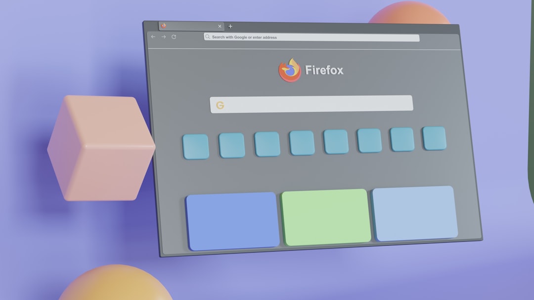
- Bootstrap 5 utility classes and Canvas HTML Template components give you a production-ready structural foundation without writing repetitive layout CSS from scratch.
Why Friction Kills Free Trial Conversions
A visitor landing on your free trial page has already cleared the awareness and consideration stages. They are close. What prevents them converting is rarely price — it is cognitive friction: too many form fields, vague value propositions, or a CTA button that fails to answer the implicit question “what happens next?”. In 2025, SaaS buyers are increasingly comparison-shopping across multiple tabs, which means your page has seconds, not minutes, to establish clarity and confidence.
The three main friction sources on a free trial landing page are:
- Form length — every additional field beyond email and password measurably reduces completion rates.
- Ambiguous commitment language — phrases like “Start your journey” say nothing; “Start free — no credit card required” removes a specific objection.
- Weak visual hierarchy — when everything competes for attention, the CTA gets lost.
Hero Section Copy That Converts
The hero section carries the highest conversion weight on the entire page. Your headline must state the outcome the user gets — not the feature they are buying. “Manage all your client projects in one place” outperforms “Introducing ProjectFlow 3.0” every time, because it speaks to the reader’s goal rather than your product timeline.
Directly beneath the headline, a single sentence of supporting copy should pre-empt the most common objection. For a SaaS product, that objection is usually commitment: “14-day free trial. No credit card required. Cancel anytime.” Each clause kills a separate concern in four words or fewer.
Here is a minimal, copy-pasteable hero section built with Bootstrap 5 — the same grid system bundled inside the Canvas HTML Template:
<section class="py-5 py-lg-7 bg-light">
  <div class="container">
    <div class="row align-items-center justify-content-between g-5">
      <div class="col-lg-6">
        <p class="text-uppercase ls-2 fw-semibold text-muted mb-2">Free 14-Day Trial</p>
        <h1 class="display-4 fw-bold lh-sm mb-3">Manage all your client projects in one place</h1>
        <p class="fs-5 text-muted mb-4">No credit card required. Cancel anytime. Set up in under 5 minutes.</p>
        <a href="#signup" class="btn btn-lg px-5 py-3 fw-semibold" style="background-color: var(--cnvs-themecolor); color: #fff; border-radius: 6px;">Start Free Trial</a>
      </div>
      <div class="col-lg-5">
        <img src="images/product-hero.png" alt="Product dashboard preview" class="img-fluid rounded shadow">
      </div>
    </div>
  </div>
</section>
Notice the CTA uses –cnvs-themecolor — the correct Canvas CSS variable — rather than a hard-coded hex value, so the colour updates globally whenever you adjust your theme. For a deeper look at how Canvas variables integrate with a broader SaaS landing page architecture, the guide on SaaS landing page design covers the full structural blueprint.
Designing the Sign-Up Form to Remove Barriers
The sign-up form is the final gate before conversion. The principle here is ruthless minimalism: collect only what you need to activate the trial. For most SaaS products, that is an email address and a password. Company name, job title, and phone number can be gathered during onboarding once the user has already committed.
Inline validation — showing a green tick as each field is completed correctly — reduces abandonment by reassuring users they are on track. A short, benefit-led label above the submit button (“Join 12,000 teams already saving 6 hours a week”) transforms a transactional moment into a motivational one.
<section id="signup" class="py-5 py-lg-6">
<div class="container">
<div class="row justify-content-center">
<div class="col-md-6 col-lg-5">
<div class="card border-0 shadow-sm p-4 p-lg-5 rounded-3">
<h2 class="h4 fw-bold mb-1">Create your free account</h2>
<p class="text-muted small mb-4">Join 12,000 teams already saving 6 hours a week.</p>
<form>
<div class="mb-3">
<label for="email" class="form-label fw-semibold">Work email</label>
<input type="email" class="form-control form-control-lg" id="email" placeholder="[email protected]" required>
</div>
<div class="mb-4">
<label for="password" class="form-label fw-semibold">Password</label>
<input type="password" class="form-control form-control-lg" id="password" placeholder="Min. 8 characters" required>
</div>
<button type="submit" class="btn btn-lg w-100 fw-semibold" style="background-color: var(--cnvs-themecolor); color: #fff;">Start Free Trial →</button>
<p class="text-center text-muted small mt-3 mb-0">No credit card. No commitment. Cancel anytime.</p>
</form>
</div>
</div>
</div>
</div>
</section>Placing Trust Signals Where They Matter Most
Trust signals work hardest when they appear at the point of hesitation — which is immediately adjacent to your CTA, not in the footer. A row of recognisable customer logos directly below the hero button, or a single pull-quote testimonial next to the sign-up form, can address the unspoken concern: “Does this actually work for businesses like mine?”
Effective trust signals for a SaaS landing page in 2025 include:
- Named testimonials with a headshot, job title, and company — anonymous quotes carry little weight.
- A usage statistic that is specific and verifiable (“used by 12,400 teams across 60 countries”).
- Security and compliance badges relevant to your audience (SOC 2, GDPR-compliant, SSL).
- Star ratings from G2, Capterra, or Product Hunt with the review count visible.
Using Bootstrap 5’s flexbox utilities to align these horizontally in a low-profile strip beneath the hero keeps them visible without dominating the layout. The Bootstrap 5 utility classes guide covers the exact alignment utilities needed to build this kind of trust bar cleanly.
Visual Hierarchy Above the Fold
On a conversion design level, above-the-fold real estate must follow a strict reading path: headline, subheadline, CTA. Supporting elements — feature lists, social proof, navigation links — should be visually subordinate. A common mistake is giving the navigation bar the same visual weight as the CTA button, which splits attention at the worst possible moment.
Practical techniques for enforcing hierarchy with Bootstrap 5 and Canvas:
- Use display-4 or display-3 for the headline to create immediate scale contrast.
- Apply a background-colour contrast between the hero section and the rest of the page — a light grey hero on a white body, or a full-bleed dark hero, creates a clear psychological “start here” zone.
- Set the primary CTA button at a minimum of 52px height and use a high-contrast colour tied to –cnvs-themecolor.
- Reduce navigation to a logo and a single “Sign in” link during the trial flow — every exit route you remove is a conversion you retain.
For teams building Canvas-based pages and looking to reduce the back-and-forth involved in layout decisions, Canvas Builder generates production-ready section HTML directly from a prompt, which removes the iterative cycle of resizing and repositioning elements manually.
Copy Testing: The Variables Worth Prioritising
Once the page is live, the highest-leverage copy test is almost always the CTA button label. “Start Free Trial” outperforms “Get Started” because it is specific about what the user receives. “Start Free Trial — No Credit Card” outperforms both because it pre-empts the objection within the label itself.
Beyond the button, test these elements in priority order:
- Headline — outcome-focused vs. feature-focused vs. question-based.
- Subheadline friction-removal copy — which specific objection to address (“no credit card”, “cancel anytime”, “set up in 5 minutes”).
- Form field count — email only vs. email and password vs. email, password, and name.
- Testimonial placement — above the fold vs. adjacent to the form vs. below the fold.
- Hero image — product screenshot vs. illustrated abstract vs. team/people imagery.
Run one test at a time with sufficient traffic — a minimum of 200 conversions per variant before drawing conclusions. Tools that generate multiple layout variants quickly, such as AI-assisted layout generators, can compress the time it takes to produce test-ready pages from days to hours.
Frequently Asked Questions
How many form fields should a free trial sign-up page have?
For most SaaS products, two fields — work email and password — is the optimum. Every additional field increases drop-off. Collect job title, company size, and other qualification data during the onboarding flow after the user has already committed to the trial.
Should a free trial landing page have a navigation menu?
Minimal navigation improves conversion rates on dedicated trial pages. A logo and a single “Sign in” link is sufficient. Full site navigation gives visitors too many exit paths at the moment you most need their attention focused on the CTA.
Where should trust signals appear on the page?
Place your most compelling trust signal — a named testimonial, a usage statistic, or a recognisable client logo row — directly below or adjacent to the primary CTA. Trust signals in the footer are too far from the point of decision to reduce hesitation effectively.
What CSS variables does Canvas HTML Template use for button colour?
Canvas uses –cnvs-themecolor for the primary brand colour. Apply it inline or in a custom stylesheet with background-color: var(--cnvs-themecolor);. Do not use Bootstrap’s –bs-primary variable or hard-coded hex values — the Canvas variable ensures your colour updates globally across all components when you change the theme.
How do I build a free trial page quickly using the Canvas HTML Template?
Use Canvas Builder to generate a single_page layout with a hero, sign-up form, social proof strip, and features section. The tool outputs production-ready Bootstrap 5 HTML using correct Canvas components and CSS variables, which you can drop directly into your Canvas project without manual restructuring.
If you’re working with the Canvas HTML Template and want to generate production-ready layouts faster, try Canvas Builder free and see how much time you save on every project.