SaaS Landing Page Templates
Build conversion-optimised SaaS landing pages with feature showcases, pricing tiers, testimonials, and compelling CTAs, all generated from a single prompt.
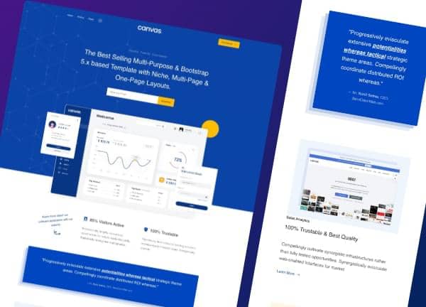
Example output
40
industry templates
1,938+
prompt templates
About 3 minutes
to build a page
Designing a SaaS landing page: what works
SaaS landing pages have one job: turn visitors into trial users or paying customers. Every design decision, from headline hierarchy to button colour, should be in service of that conversion goal. The best SaaS pages communicate value instantly, remove friction, and build trust through specificity.
Above-the-Fold Value Communication
You have 3 to 5 seconds to answer 'what does this do and why should I care?' A punchy headline (the outcome, not the feature), a single sentence of context, and one prominent CTA is the proven formula. Avoid vague superlatives: 'the most powerful platform' says nothing; '3x faster deployments in one click' says everything.
Feature Hierarchy and Social Proof Placement
Lead with your top 3 differentiating features, not a laundry list. Interleave social proof (testimonials, logos, review scores) throughout the page rather than isolating it in one section. Trust signals near CTAs dramatically increase conversion rates.
Pricing Page Psychology
Three tiers work best for SaaS: Starter, Pro, and Enterprise. Highlight the recommended tier visually. Use anchoring: place the most expensive plan first or second to make the target plan feel like a bargain. List what's included, not what's excluded.
Motion and Interactivity Done Right
Subtle scroll-triggered animations make SaaS pages feel polished and modern. However, heavy animations that delay content rendering increase bounce rates. Use CSS transitions and Canvas scroll-detect patterns rather than heavy JS animation libraries.
Ready to build?
Describe your SaaS landing page in plain English and Canvas Builder builds it, ready to edit and export. No design skills needed.
5 design tips for SaaS landing pages
Lead with outcomes, not features
Your headline should describe what the user achieves, not what your software does. 'Ship code 3x faster' outperforms 'Automated CI/CD pipeline' every time.
Use a floating header
A floating pill-style header with a prominent 'Start Free Trial' CTA keeps the conversion action visible as users scroll. The Canvas floating-header pattern is ideal for this.
Add a product screenshot above the fold
Show the actual interface in the hero, not an abstract illustration. A cropped UI screenshot with a subtle drop shadow builds credibility and gives visitors a concrete sense of the product.
Include a logo strip early
A 'Trusted by teams at...' logo bar placed immediately below the hero is one of the highest-ROI trust elements in SaaS. Use greyscale logos to keep the visual hierarchy clean.
Make the pricing section ultra-clear
Pricing confusion is a conversion killer. Every tier should have: a price, a 1-sentence description, a bulleted feature list, and a CTA button. Avoid footnotes and asterisks where possible.
Try this prompt
Use it as it is, or change the names, colours and sections to match your business.
Create a full-page SaaS landing page for a developer tool called 'Deployr' that automates cloud infrastructure setup. Use a dark floating header, gradient mesh hero with a code terminal UI mockup on the right, a greyscale logo strip, a 3-column feature grid with icons, a how-it-works 3-step section, a 3-tier pricing table with the Pro plan highlighted, and testimonial cards. Use dark navy and electric blue accents.Frequently asked questions
What sections should a SaaS landing page have?
A high-converting SaaS landing page typically includes: Hero (headline + CTA), Social Proof (logos/reviews), Features (3 to 6 key benefits), How It Works (3-step process), Pricing, More Testimonials, and a final CTA banner. FAQ sections are increasingly common and help with SEO.
How long should a SaaS landing page be?
Long enough to answer every objection a prospect might have. For self-serve products under $50/mo, a medium-length page (5 to 8 sections) usually converts well. Enterprise products with complex buying cycles benefit from longer, more detailed pages.
Should I use a free trial or freemium CTA?
Free trial CTAs ('Start Free Trial') convert better for higher-priced SaaS where users need to experience value before paying. Freemium ('Get Started Free') works better for tools where habitual use drives upgrade decisions. Test both if you're unsure.
How do I show pricing if I have custom/enterprise tiers?
Show your standard tiers with prices, then have an 'Enterprise' column with 'Contact Sales' instead of a price. Include a brief description of what enterprise adds (SSO, SLAs, dedicated support) so prospects self-qualify.
What's the ideal number of CTAs on a SaaS landing page?
Use one primary CTA consistently throughout (e.g., 'Start Free Trial'). You can use a secondary CTA like 'See a demo' for fence-sitters. Having too many different CTAs causes decision paralysis: keep the primary action singular.
Related templates
Startup Website Templates
Build startup websites that attract users, investors, and press: featuring product demos, founder credibility, waitlist capture, and clean modern design that signals serious execution.
View templates →AI Tool Website Templates
Build AI product websites that convert, with live demo showcases, before/after comparisons, technical feature grids, and modern design language that signals serious AI engineering.
View templates →Digital Agency Website Templates
Build digital agency websites that win pitches and attract inbound, with service showcases, work portfolio, client results, and the sophisticated design that tells prospects you understand the internet.
View templates →Build your SaaS landing page in minutes
Describe what you need. Canvas Builder writes production-ready Bootstrap 5 HTML on the Canvas design system, ready to publish or export.