Agency Website Examples
Agency websites have one of the hardest conversion jobs in web design: they must simultaneously showcase creative credibility, communicate strategic capability, and generate qualified leads. The best agency sites do all three: here's how.
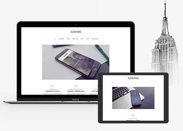
From the Canvas template
The Canvas design system that Canvas Builder builds on
A preview of a Canvas template demo for this niche. Canvas Builder generates new layouts in the same Bootstrap 5 system from your own description, so your page is built for your business rather than copied from a demo.
See agency website templatesWhat makes a great agency website?
Work-first navigation
Top agency sites lead with the work: case studies that demonstrate results, not just aesthetics. Clients don't hire agencies for pretty websites; they hire them for outcomes. Case studies with specific metrics (revenue growth, conversion lift, traffic increase) convert better than portfolio screenshots.
Credibility signals at every scroll depth
Client logos, awards, press mentions, team size, years in operation: the best agencies surface credibility signals throughout the page, not just in one section. Every scroll should encounter a new reason to trust.
Service specificity
Vague service descriptions ('We do digital marketing') lose to specific ones ('Facebook and Google ads for e-commerce brands doing $500k to $5M/year'). Specificity attracts the right clients and repels the wrong ones: both are desirable.
Team humanisation
B2B buyers hire people, not companies. The best agency sites feature real team members with photos, names, and roles. A LinkedIn-style team page communicates stability, expertise, and that there are real humans behind the work.
Common agency website design patterns
The visual styles most commonly used across top agency website sites.
Bold typographic hero
Oversized agency name or statement as the dominant hero element. Communicates confidence. Often paired with a contrasting accent colour.
Used by: Creative agencies, brand studios, design consultancies
Case study hero
The hero section is a featured case study: client name, brief result, and a visual. Work is the first thing visitors see, not the agency brand.
Used by: Performance marketing agencies, UX studios, development shops
Monochromatic minimal
Single colour palette with heavy whitespace and typography-driven layouts. Signals sophisticated taste and restraint.
Used by: High-end brand agencies, luxury-focused creative studios
Dark + neon accent
Dark background (charcoal or near-black) with a bright neon accent (electric blue, lime, or coral). Signals digital-native and tech-forward culture.
Used by: Digital agencies, tech-focused marketing firms, developer studios
Must-have elements
- 3 to 5 in-depth case studies with results and metrics
- Client logo strip (recognisable brands first)
- Clear service definition and specialisation statement
- Team section with real photos and names
- Awards, press, or industry recognition
- Testimonials with specific project context
- Lead capture form or consultation booking
- Process section (how you work)
- Clear statement of who you work with (ideal client profile)
Common mistakes to avoid
- Portfolio without results: 'we made it look nice' is not a business case
- Generic hero copy ('We build brands that matter', who doesn't?)
- No ideal client profile: attracts every lead, qualifies none
- Stock photography of 'diverse team in meeting room'
- No pricing or engagement model transparency
- Contact form with no response time expectation
Describe your own agency website
Edit the prompt or pick a starting point. Canvas Builder builds it live on the Canvas design system.
Frequently asked questions
Should an agency list its prices on its website?
Transparency varies by agency type. Productised agencies (fixed-scope, fixed-price services) should absolutely list prices: it pre-qualifies leads and saves time. Custom/bespoke agencies typically don't list prices but should indicate minimum engagement size or a 'starting from' range.
How many case studies should an agency website have?
Three to five in-depth case studies outperform fifteen shallow ones. Each case study should cover the brief, the approach, the execution, and quantified results. Depth signals rigour and process.
Generate your own agency website
Describe your agency website and Canvas Builder generates production-ready Bootstrap 5 HTML in about 3 minutes. No designer, no subscription.
More website examples
Hospitality
Restaurant Website ExamplesThe best restaurant websites do one thing above all else: make you hungry. They translate the sensory experience of dining (warmth, atmosphere, taste) into a visual experience that compels visitors to book a table or place an order. Here's what separates great restaurant websites from forgettable ones.See examplesTechnology
SaaS Landing Page ExamplesSaaS landing pages are conversion machines: every element exists to move a visitor from 'interested' to 'signed up'. The best examples communicate value in seconds, remove every possible friction point, and use social proof precisely where doubt is highest. Here's what makes the top performers stand apart.See examplesCreative
Portfolio Website ExamplesA portfolio website is your most important sales tool as a creative professional. The best examples are simultaneously a demonstration of skill and a conversion tool: they show the work, communicate the process, and make it easy to hire. Here's what makes portfolio sites exceptional.See examples