SaaS Landing Page Examples
SaaS landing pages are conversion machines — every element exists to move a visitor from 'interested' to 'signed up'. The best examples communicate value in seconds, remove every possible friction point, and use social proof precisely where doubt is highest. Here's what makes the top performers stand apart.
Generated with Canvas Builder
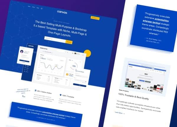
Example saas landing page layout — generated by Canvas Builder using the Canvas Bootstrap 5 framework. See all SaaS Landing Page templates →
What Makes a Great SaaS Landing Page?
Outcome-focused hero headline
The best SaaS landing pages lead with the outcome users get — not the features they'll use. 'Close 2x more deals' beats 'AI-powered CRM'. The hero headline answers 'what's in it for me?' in one sentence.
Interactive product preview
Top SaaS examples embed a product screenshot, animated GIF, or interactive demo directly in the hero. Users see what they're signing up for before reading a word of copy. This reduces churn from misaligned expectations.
Micro-copy that reduces friction
The best CTAs don't say 'Sign Up'. They say 'Start Free — No Credit Card' or 'Try for 14 Days'. Every line of micro-copy near a CTA should pre-empt an objection.
Feature-to-benefit translation
Great SaaS pages don't list features — they translate each feature into a user benefit. 'AI analysis' becomes 'Understand your customers in minutes, not days'. Every feature section answers 'so what?'
Common SaaS Landing Page Design Patterns
The visual styles most commonly used across top saas landing page sites.
Dark gradient hero
Deep navy or dark purple gradient background with bright product screenshots and white text. Signals technical sophistication and premium quality.
Used by: Developer tools, analytics, AI platforms, fintech
White + accent minimal
White background with one strong accent colour (blue, green, or purple). Clean typography, generous whitespace, and product-focused imagery.
Used by: Productivity tools, project management, HR software
Bold purple/blue gradient
Gradient fills in headlines and UI elements. Energetic and modern. Common in newer SaaS brands targeting tech-forward users.
Used by: AI tools, CRMs, marketing automation
Social proof wall above fold
Logo strips of well-known customers placed immediately below the hero. Establishes credibility before the visitor reads any copy.
Used by: Enterprise SaaS, B2B tools with notable customers
Must-Have Elements
- ✓Outcome-focused headline (benefit, not feature)
- ✓Product screenshot or demo video in the hero
- ✓Primary CTA with friction-reducing micro-copy
- ✓Customer logo strip (social proof above fold)
- ✓Feature-to-benefit section (3 core differentiators)
- ✓Testimonials with specific, quantified results
- ✓Pricing section with clear tier comparison
- ✓FAQ section addressing top objections
- ✓Secondary CTA at page bottom
Common Mistakes to Avoid
- ✗Feature-led headline ('The most powerful CRM') instead of outcome-led
- ✗Generic CTA copy ('Sign Up', 'Get Started') without friction reduction
- ✗No product screenshot in the hero — visitors don't know what they're signing up for
- ✗Testimonials without specifics ('Great product!' proves nothing)
- ✗Hiding pricing — forces users to book a demo for basic information
- ✗Too many CTAs competing for attention across the page
Frequently Asked Questions
How long should a SaaS landing page be?
What conversion rate should a SaaS landing page achieve?
Should a SaaS landing page have navigation?
Generate Your Own SaaS Landing Page
Describe your saas landing page — Canvas Builder generates production-ready Bootstrap 5 HTML in ~3 minutes. No designer, no subscription.
More Website Examples
Restaurant Website Examples
The best restaurant websites do one thing above all else: make you hungry. They …
See examples →Portfolio Website Examples
A portfolio website is your most important sales tool as a creative professional…
See examples →Agency Website Examples
Agency websites have one of the hardest conversion jobs in web design: they must…
See examples →