Law Firm Website Examples
Law firm websites must accomplish something unusual: build enough trust to convince a potential client to share their most sensitive problems. The best legal sites balance professional authority with human accessibility: they feel trustworthy, not intimidating.
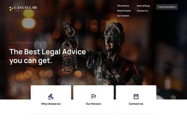
From the Canvas template
The Canvas design system that Canvas Builder builds on
A preview of a Canvas template demo for this niche. Canvas Builder generates new layouts in the same Bootstrap 5 system from your own description, so your page is built for your business rather than copied from a demo.
See law firm website templatesWhat makes a great law firm website?
Attorney profiles that humanise the firm
Behind every legal matter is a human crisis: divorce, business dispute, accident, criminal charge. The best law firm sites feature detailed attorney profiles with professional photos (not stuffy headshots), practice areas, years of experience, and a personal note about their approach to client relationships.
Practice area pages with search intent
Top legal sites have deep, individual pages for each practice area: 'Divorce Lawyer Sydney', 'Commercial Property Law', 'Workers Compensation'. These pages target specific search queries and explain the firm's approach to that area in plain English.
Social proof through results
Case results (where ethically permissible), client testimonials, and media mentions build credibility. The best legal sites highlight significant wins and recognitions prominently, without overpromising outcomes to prospective clients.
Consultation booking made easy
The primary conversion on a law firm site is a consultation booking or initial enquiry. Top firms offer a clear, low-commitment entry point: 'Free 15-minute consultation', 'No-obligation enquiry', or 'Confidential initial assessment'. Reduce the perceived barrier to contact.
Common law firm website design patterns
The visual styles most commonly used across top law firm website sites.
Professional dark navy
Deep navy blue with white and gold accents. Signals authority, stability, and trustworthiness. Classic legal aesthetic.
Used by: Commercial law, litigation, corporate firms
Warm accessible palette
Warmer tones (deep green, warm grey, or soft burgundy) with approachable photography. Signals accessibility alongside competence.
Used by: Family law, employment law, personal injury
Modern white + single accent
Clean white with a strong single accent colour (typically blue or green). Contemporary feel that signals a progressive firm.
Used by: Technology law, startup law, IP firms
Must-have elements
- Attorney profiles with professional photography
- Individual practice area pages
- Consultation booking or enquiry CTA
- Case results or notable matters (where ethically permissible)
- Client testimonials with practice area context
- Office location and jurisdiction information
- Clear statement of who the firm serves
- Blog with plain-English legal content
Common mistakes to avoid
- Generic attorney bios ('John has 20 years of experience') with no personality
- Single 'Practice Areas' page instead of individual optimised pages
- No consultation CTA: expecting prospects to find the phone number themselves
- Legal jargon in headlines (inaccessible to non-lawyers who are your clients)
- No blog: missed opportunity for local SEO and authority building
Describe your own law firm website
Edit the prompt or pick a starting point. Canvas Builder builds it live on the Canvas design system.
Frequently asked questions
Should a law firm blog on their website?
Yes, practice area blog posts ('What to do after a car accident in NSW') target exactly the searches potential clients make at their moment of need. A consistent blog is the highest-ROI SEO investment for law firms.
Can a law firm include testimonials on their website?
Rules vary by jurisdiction and bar association. In most regions, client testimonials are permitted if they don't make promises about results and include appropriate disclaimers. Check your local bar association's advertising rules.
Generate your own law firm website
Describe your law firm website and Canvas Builder generates production-ready Bootstrap 5 HTML in about 3 minutes. No designer, no subscription.
More website examples
Hospitality
Restaurant Website ExamplesThe best restaurant websites do one thing above all else: make you hungry. They translate the sensory experience of dining (warmth, atmosphere, taste) into a visual experience that compels visitors to book a table or place an order. Here's what separates great restaurant websites from forgettable ones.See examplesTechnology
SaaS Landing Page ExamplesSaaS landing pages are conversion machines: every element exists to move a visitor from 'interested' to 'signed up'. The best examples communicate value in seconds, remove every possible friction point, and use social proof precisely where doubt is highest. Here's what makes the top performers stand apart.See examplesCreative
Portfolio Website ExamplesA portfolio website is your most important sales tool as a creative professional. The best examples are simultaneously a demonstration of skill and a conversion tool: they show the work, communicate the process, and make it easy to hire. Here's what makes portfolio sites exceptional.See examples