Photography Website Examples
A photography website is the work. There's no marketing copy, no feature matrix, no pricing table that matters as much as the quality and curation of images on the page. But how those images are presented (the loading speed, the editing, the flow) separates sites that win clients from those that don't.
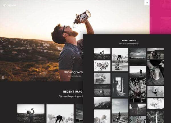
From the Canvas template
The Canvas design system that Canvas Builder builds on
A preview of a Canvas template demo for this niche. Canvas Builder generates new layouts in the same Bootstrap 5 system from your own description, so your page is built for your business rather than copied from a demo.
See photography website templatesWhat makes a great photography website?
Curation over volume
The best photography sites show 15 to 25 images per gallery, not 200. Every image included should be the photographer's best work in that category. Visitors judge the photographer by the weakest image they see, not the strongest.
Speed-optimised image delivery
Photographer sites frequently fail on page speed: ironic, given they're image-first. The best sites use lazy loading, WebP format, CDN delivery, and appropriately compressed images that look great without slowing the page. A 10-second load time kills the experience before a single image is seen.
Style consistency across the portfolio
Top photography sites have a recognisable visual signature: consistent editing style, colour palette, and subject treatment across all gallery images. This signature is the photographer's brand. A mixed portfolio of wildly different styles signals that the photographer hasn't found their voice.
Specialist positioning in the headline
The best photography sites don't say 'I'm a photographer'. They say 'Architecture photographer in London' or 'Wedding photographer for adventurous couples'. Specialisation narrows the audience and improves conversion from the right clients.
Common photography website design patterns
The visual styles most commonly used across top photography website sites.
Full-bleed masonry grid
Edge-to-edge image grid with varying aspect ratios. Let the photography dominate. Minimal UI chrome.
Used by: Wedding photographers, portrait photographers, lifestyle
Full-screen slideshow hero
Auto-advancing full-viewport hero with 4 to 6 hero images. Immediately showcases range and quality.
Used by: Commercial photographers, travel photographers, landscape
Dark editorial grid
Black background with white typography. Images float in the dark. Dramatic and high-end.
Used by: Fashion photographers, fine art photographers, editorial
Minimal white grid
White background, generous padding around images. Images breathe. Elegant and timeless.
Used by: Architecture, product, food photographers
Must-have elements
- Curated gallery with only strongest work
- Specialisation statement in the hero headline
- Contact form with project enquiry fields
- Pricing or package overview
- Client testimonials with wedding/project context
- About page with personality and process
- Fast-loading, optimised images
Common mistakes to avoid
- Too many images: dilutes the impact of the best work
- Inconsistent editing style across the gallery
- Slow loading: unoptimised full-resolution image files
- No specialisation: 'I photograph everything' attracts no one specifically
- No pricing: makes booking enquiry feel daunting
Describe your own photography website
Edit the prompt or pick a starting point. Canvas Builder builds it live on the Canvas design system.
Frequently asked questions
Should a photographer show pricing on their website?
Generally yes, at least package starting prices. Enquiries from clients who've seen pricing are pre-qualified. Without pricing, you'll spend significant time quoting for clients who are far outside your budget range.
How many photos should a photography portfolio have?
15 to 30 per gallery or style category is the sweet spot. For a wedding photographer, that's 20 to 30 images showing range across ceremony, portraits, and reception. Anything above 50 in one gallery requires exceptional curation and fast loading.
Generate your own photography website
Describe your photography website and Canvas Builder generates production-ready Bootstrap 5 HTML in about 3 minutes. No designer, no subscription.
More website examples
Hospitality
Restaurant Website ExamplesThe best restaurant websites do one thing above all else: make you hungry. They translate the sensory experience of dining (warmth, atmosphere, taste) into a visual experience that compels visitors to book a table or place an order. Here's what separates great restaurant websites from forgettable ones.See examplesTechnology
SaaS Landing Page ExamplesSaaS landing pages are conversion machines: every element exists to move a visitor from 'interested' to 'signed up'. The best examples communicate value in seconds, remove every possible friction point, and use social proof precisely where doubt is highest. Here's what makes the top performers stand apart.See examplesCreative
Portfolio Website ExamplesA portfolio website is your most important sales tool as a creative professional. The best examples are simultaneously a demonstration of skill and a conversion tool: they show the work, communicate the process, and make it easy to hire. Here's what makes portfolio sites exceptional.See examples