Startup Website Examples
Startup websites face a unique challenge: building credibility and generating demand before you've proven yourself. The best startup sites are honest about being early, specific about the problem they solve, and relentless about capturing interested visitors before they leave.
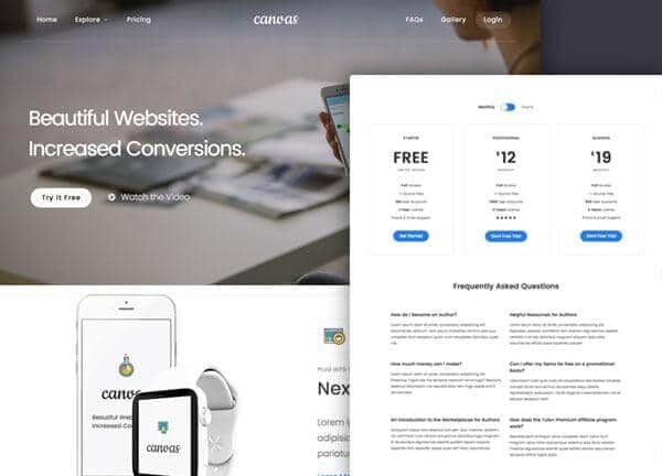
From the Canvas template
The Canvas design system that Canvas Builder builds on
A preview of a Canvas template demo for this niche. Canvas Builder generates new layouts in the same Bootstrap 5 system from your own description, so your page is built for your business rather than copied from a demo.
See startup website templatesWhat makes a great startup website?
Ruthless problem clarity
Top startup sites nail the problem in one sentence before describing the solution. 'Most businesses lose 20% of revenue to invoice payment delays. We fix that.' Problem-first copy builds immediate resonance with the target audience and filters out everyone else.
Founder credibility
Early-stage startups have no track record, but founders often do. The best startup sites surface founder credentials (previous companies, domain expertise, relevant work experience) to build credibility in the absence of customer testimonials.
Waitlist or early access as the primary CTA
Pre-launch startups convert best with a low-commitment CTA: 'Join the waitlist', 'Get early access', 'Be the first to know'. This captures demand before the product is ready and builds a launch list. The email address is more valuable than a page view.
Traction proof, however small
Early traction signals (waitlist size, pilot customers, beta users, media coverage) should be surfaced immediately. '500 businesses on the waitlist' or 'Featured in TechCrunch' converts better than any copy about the product's potential.
Common startup website design patterns
The visual styles most commonly used across top startup website sites.
Gradient hero with device mockup
Bold purple or blue gradient with a product screenshot or device mockup. Energetic, modern, and communicates product quickly.
Used by: SaaS startups, apps, tech ventures
Minimal text + waitlist
Very spare design: one headline, one paragraph, one email field. Forces complete clarity on the value proposition.
Used by: Pre-launch products, stealth startups
Problem/solution split
Two-panel hero: left panel states the problem with painful specificity; right panel states the solution with confident brevity.
Used by: B2B startups with a clear incumbent to displace
Must-have elements
- Problem statement before solution description
- Waitlist or early access CTA
- Founder credibility and story
- Early traction signals (users, press, waitlist size)
- Product preview or screenshot
- Clear audience statement (who this is for)
- FAQs addressing scepticism
Common mistakes to avoid
- Solution before problem: 'We built an AI CRM' means nothing without context
- Vague audience ('For everyone who...')
- No founder or team section: anonymous startups are low-trust
- No email capture: visitors leave with no way to follow up
- Overdesigned for a pre-launch product: spend that energy on the product itself
Describe your own startup website
Edit the prompt or pick a starting point. Canvas Builder builds it live on the Canvas design system.
Frequently asked questions
How much should I spend on a startup website?
As little as possible before product-market fit. A single landing page with a clear value proposition and email capture is all you need pre-launch. Save design budget for post-validation, when you know who your customer is and what they respond to.
Should a startup list pricing before launch?
Optional, but often beneficial. 'Starting at $X/month' pre-qualifies leads and sets price anchoring early. If pricing is still uncertain, omit it, but include it as soon as you have a model to test.
Generate your own startup website
Describe your startup website and Canvas Builder generates production-ready Bootstrap 5 HTML in about 3 minutes. No designer, no subscription.
More website examples
Hospitality
Restaurant Website ExamplesThe best restaurant websites do one thing above all else: make you hungry. They translate the sensory experience of dining (warmth, atmosphere, taste) into a visual experience that compels visitors to book a table or place an order. Here's what separates great restaurant websites from forgettable ones.See examplesTechnology
SaaS Landing Page ExamplesSaaS landing pages are conversion machines: every element exists to move a visitor from 'interested' to 'signed up'. The best examples communicate value in seconds, remove every possible friction point, and use social proof precisely where doubt is highest. Here's what makes the top performers stand apart.See examplesCreative
Portfolio Website ExamplesA portfolio website is your most important sales tool as a creative professional. The best examples are simultaneously a demonstration of skill and a conversion tool: they show the work, communicate the process, and make it easy to hire. Here's what makes portfolio sites exceptional.See examples