Fitness & Gym Website Examples
Fitness websites sell transformation: the gap between where someone is and where they want to be. The best gym and fitness sites make that transformation feel achievable, imminent, and specific. Here's what separates the standout examples from the generic.
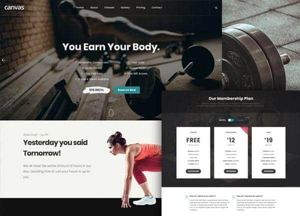
From the Canvas template
The Canvas design system that Canvas Builder builds on
A preview of a Canvas template demo for this niche. Canvas Builder generates new layouts in the same Bootstrap 5 system from your own description, so your page is built for your business rather than copied from a demo.
See fitness & gym website templatesFitness & Gym Website design inspiration: real examples
Every example below is a real fitness & gym website built with Canvas Builder. Tap any prompt to open it in the builder and make it your own.
 Built with Canvas Builder
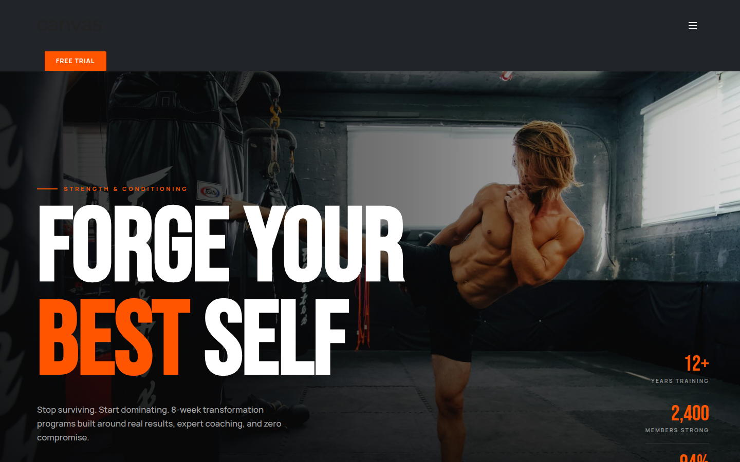
Modern Strength & Conditioning Gym
Full fitness websiteA complete gym website produced in a single pass, not a lone section. The hero treats one training photograph as the whole stage, then lays an oversized condensed headline ('Forge Your Best Self') and a free-trial button across the lower edge so the call to action sits where the eye lands. From there the page walks a visitor through the full decision: why this gym, when classes run, what membership costs, who coaches, and what members achieved, each block kept dark and spacious so nothing competes. The single electric-orange accent carries every primary action through the page, which is what gives the layout its disciplined, premium feel rather than a busy one.
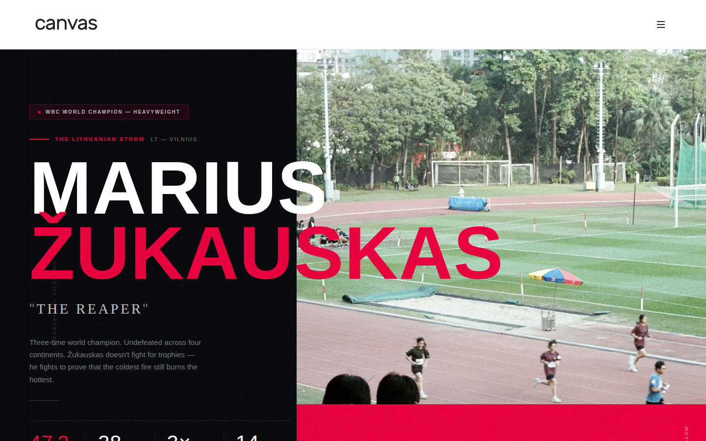
Cinematic Athlete Profile
Athlete / personal-brand siteA split hero that treats the athlete like a film poster: a tall near-black column carries an oversized name in white with a single red accent, while a full-bleed action photograph fills the right. The dark-on-dark restraint and the one aggressive accent colour do all the work, there is no clutter competing with the imagery. This is the dark-mode-first, editorial direction that the best 2026 fitness brands lean into.
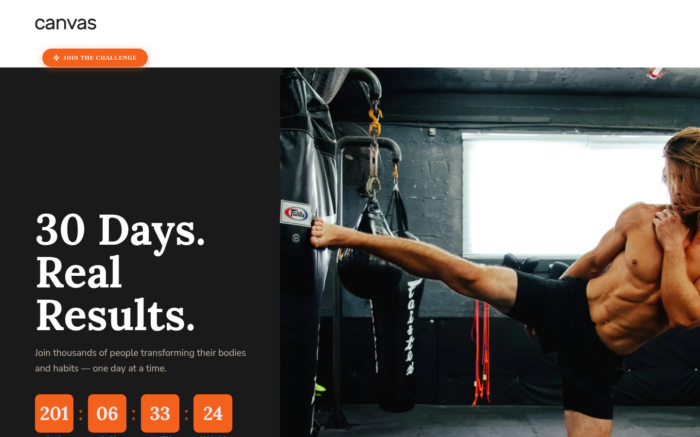
30-Day Challenge Landing Page
Fitness challenge / campaign pageConversion-first, but still dark and high-energy. A bold serif headline anchors the left while a countdown and orange CTA blocks create urgency the moment the page loads; the athlete photo on the right keeps it human. Orange-on-black is the colour story doing the heavy lifting, it reads as energetic without tipping into noise.
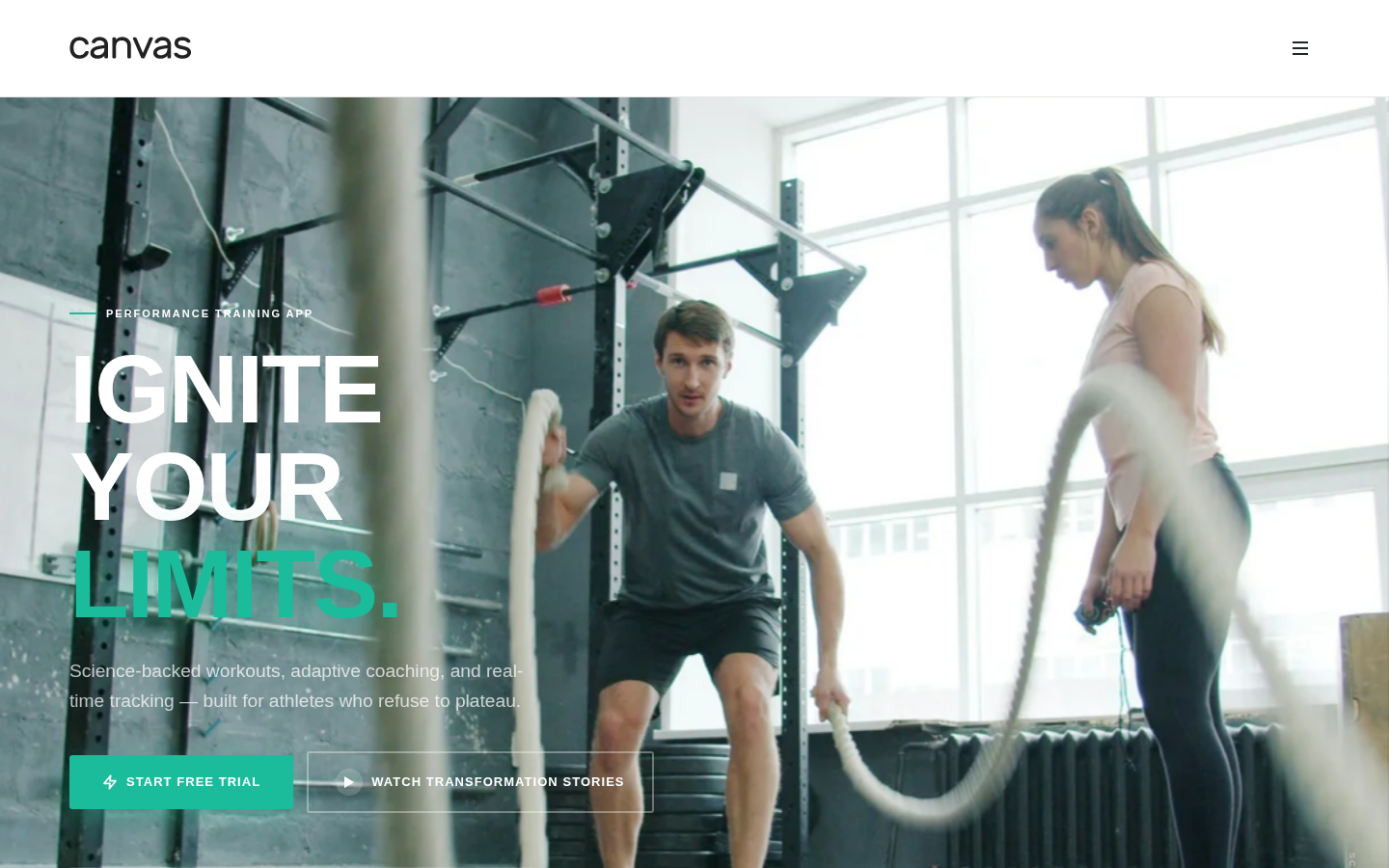
Full-Bleed App Hero
Fitness app hero sectionThe photograph is the interface. A full-viewport action shot carries layered display type and two CTAs, with a five-star rating badge anchored low-left as quiet social proof. Electric orange picks out the primary action against the dark image, the pattern almost every top fitness app hero converges on because it sells motion and outcome in a single glance.
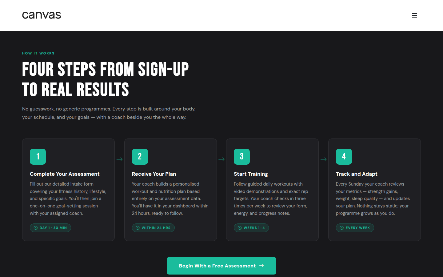
Coaching Onboarding Steps
Process / how-it-works sectionA four-step onboarding row that makes a service feel effortless: large orange number badges, one bold heading per step, a tight two-line description, and a time badge that sets expectations. On a dark background the numbered cards scan in seconds, exactly the clarity a coaching funnel needs before asking for a commitment.
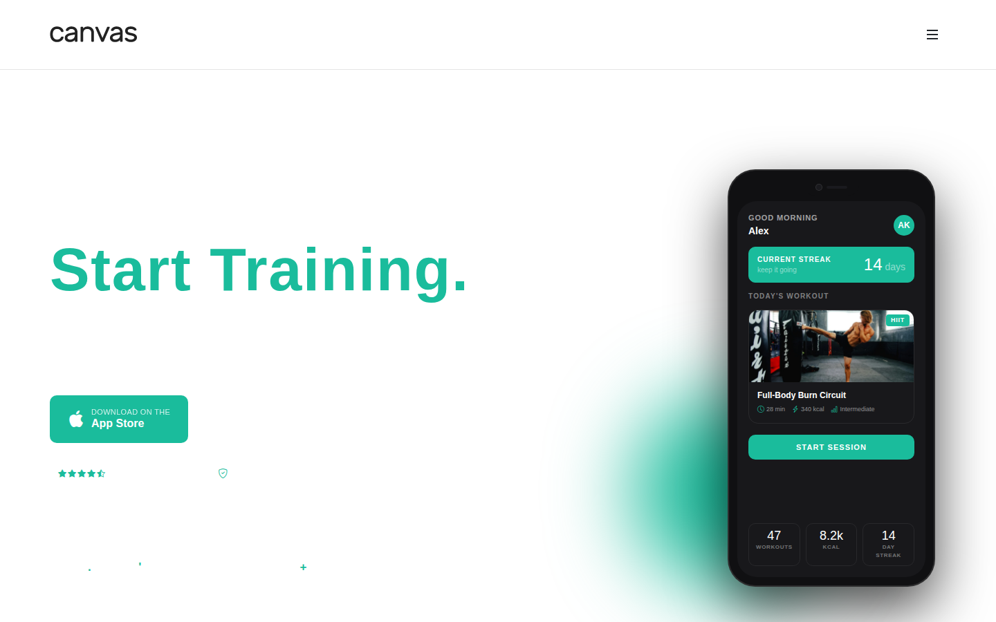
App Download CTA
App download / CTA sectionA two-column download block where every element serves one action. The left side states the offer plainly and stacks App Store and Google Play buttons, a 4.8 rating, a no-credit-card note and a press-logo strip; the right shows the app on a phone so visitors see what they are installing. Direct, dark and uncluttered, persuasion by clarity rather than gradients.
What makes a great fitness & gym website?
Aspirational before-and-after positioning
Top fitness sites don't sell memberships: they sell the version of you that has a membership. Hero copy focuses on transformation and outcomes. 'Get stronger in 30 days' beats 'Join our gym'. The best sites use member transformation stories and results as primary content.
Class schedule and booking without friction
Fitness sites that embed timetable and booking tools (Mindbody, TeamUp, or custom) directly on the page convert better than those that link out. Reduce the steps between 'I want to try this class' and 'I've booked it' to as few as possible.
Trainer profiles that build connection
People join gyms for trainers as much as facilities. Top fitness sites feature trainer profiles with specialisations, certifications, and personal stories. A trainer you feel you know before you walk in is a powerful conversion driver.
Social proof through member results
Testimonials with before/after contexts and specific metrics ('Lost 12kg in 90 days, ran my first marathon') outperform generic reviews. Video testimonials are increasingly common and highly effective.
Common fitness & gym website design patterns
The visual styles most commonly used across top fitness & gym website sites.
Dark + energy accent
Black or very dark background with a high-energy accent (electric yellow, neon green, or bright red). Communicates intensity and performance culture.
Used by: CrossFit boxes, powerlifting gyms, performance training centres
Clean white + bold photography
White space with powerful action photography: athletes mid-movement, weights in use. Aspirational but approachable.
Used by: Boutique studios, yoga studios, pilates, functional fitness
Energetic gradient hero
Deep gradient (purple to blue, orange to red) with white typography and dynamic imagery. High-energy and modern.
Used by: Online fitness platforms, personal training brands, fitness apps
Must-have elements
- Transformation-focused hero copy
- Class timetable or schedule (embedded)
- Membership options with clear pricing
- Trainer profiles with specialisations
- Member results and testimonials
- Free trial or first class CTA
- Facility photos (gym floor, equipment, amenities)
- Location, hours, and parking information
- Mobile-optimised booking flow
Common mistakes to avoid
- Membership pricing hidden behind a 'contact us'
- No class schedule visible on the website
- Stock fitness photography instead of actual members
- Trainer pages with no personality or specialisation info
- No free trial or trial class offer to reduce commitment barrier
Describe your own fitness & gym website
Edit the prompt or pick a starting point. Canvas Builder builds it live on the Canvas design system.
Frequently asked questions
Should a gym website show pricing?
Yes, hiding pricing frustrates prospects and drives them to competitors. Memberships with transparent pricing convert better. If pricing is complex (personal training packages, corporate rates), show at least a 'starting from' figure.
What's the most important page on a fitness website?
The class schedule or 'How to Start' page. Most people visiting a gym site are trying to understand what it's like to be a member, not read marketing copy. A clear, accessible timetable or beginner's guide converts better than any hero section.
What works for a dark-mode fitness app or dashboard design?
The strongest dark-mode fitness designs pair a near-black background with one electric accent (orange, red, or neon green), use full-bleed action photography as the hero, and keep typography oversized and confident. Numbered step cards, rating badges, and countdown urgency read instantly on dark. The gallery above shows real examples built with Canvas Builder using exactly these patterns.
Generate your own fitness & gym website
Describe your fitness & gym website and Canvas Builder generates production-ready Bootstrap 5 HTML in about 3 minutes. No designer, no subscription.
More website examples
Hospitality
Restaurant Website ExamplesThe best restaurant websites do one thing above all else: make you hungry. They translate the sensory experience of dining (warmth, atmosphere, taste) into a visual experience that compels visitors to book a table or place an order. Here's what separates great restaurant websites from forgettable ones.See examplesTechnology
SaaS Landing Page ExamplesSaaS landing pages are conversion machines: every element exists to move a visitor from 'interested' to 'signed up'. The best examples communicate value in seconds, remove every possible friction point, and use social proof precisely where doubt is highest. Here's what makes the top performers stand apart.See examplesCreative
Portfolio Website ExamplesA portfolio website is your most important sales tool as a creative professional. The best examples are simultaneously a demonstration of skill and a conversion tool: they show the work, communicate the process, and make it easy to hire. Here's what makes portfolio sites exceptional.See examples